Litho Printing: Mass printing preferably for over 100, better quality

Self cover: Frontpage is the same weight as the rest of the booklet, if the frontage is a heavy weight and stock it is sometimes charged a lot more.

Tumble Stroke: Double sided print

Digital: Powdered inks, not as nice as litho print.

Mistakes designers make when coming to print:
- Bleed 3mm, ticks, crop marks
- CMYK
- Brochures, pages as singles not as spreads
- Don't use spot colours with transparency
- Foiling, perforation
- Business cards, send one not many on one page, let them organise the cards.
- Artwork 300dpi


In today's workshop we were assigned to do an old YCN competition from last year where they asked young creatives to take a new approach to yahoo and make it more appealing to 13-18 year olds. We were asked to form groups and discuss what would be most appropriate and to consider their main competitor google. As we went onto the yahoo website we instantly seen it was way too cluttered and overpowering with information. I feel as though the website was not well thought out or designed. The amount of information too is just quite desperate as though they are running out of ideas to compete in the industry. 

We started brainstorming ideas and thinking of ways to simplify the website but still make it appropriate to the target audience. One of the ideas was to create icons instead of the different tabs as they could nicely represent the information and not look too cluttered. Also condensing the information down and sorting it into six different icons will make it much more easy for the audience to navigate around.

We decided to go for a very minimal but effective look, starting with the six icons we chose; mail, search, news, entertainment, shopping and film. We played around with layout and agreed that all six icons would look effective position as a 3X2 grid in the centre of the page, this would be the homepage. Once the user logs in the icons would position themselves to the right and left bars of the page leaving a blank page in the centre where the information will appear depending on what icon the user choses. We also played about with layout for different devices and formats such as web, iPhone, iPad etc. 


User experience Design

What is user experience?

The role a product plays in a persons life.

Blackberry VS Iphone
- Efficiency
- Cheap? Fast?
- Emotional satisfaction
- Quality
- Empathy with the product
- Branding, identity of company

Current Companies

Asos vs Topshop
Itunes vs Windows media
Ebay vs Amazon
Yahoo vs Google
Pinterest vs Tumblr
Youtube vs Vimeo


Target Audience Personna:

Key goals

- Inform the public on the history of seasides.
- Educate them wight eh decline in tourism.
- Influence them to want to visit these destinations.

We Must

- show clear and easy navigation
- Keep the audience interested
- Make it look appealing
- Use imagery and body text

Behaviours

- Get confused with over complicated designs
- Want to find information easy and fast
- Want something they can easily access

We Must Never

- Over complicate website
- Too much information


Web standards and limitations
HTML - The language we need to learn
WYSIWYG - What you see is what you get
SEO - Search engine optimisation
FTP - File Transfer Protocol
URL - Domain name (Address to folder on server)

XML
PHP
ASP        Advanced language
JSP
CGI

Information on a database such as the description of a product, Amazon is a good example where you type a word of a product which brings up hundreds of pages that contain that word.

HTTP - Hyper text transfer protocol
HTTPS

UI -  User Interface
UX - User Experience - How easy, engaging, entertaining it is.

WWW - Worldwide web

Limitations

216 Websafe Colours

When colour first arrived on the web computers could only support a maximum of 256 colours on their 9-bit monitors. A list of 216 "Web Safe Colours" were identified.

These colours were/are reproduced consistently across the web using HTML, specifically a six or where possible a three digit hexadecimal code.

Red
#FF0000
#FF0

White
#FFFFFFF
#FFF

Black
#0000000
#000

The RGB colour mode is capable of reproducing 16 million different colours, significantly more than HEX 216 colours.

The combination of Red, Green, Blue values from 0 to 255 (256 unique shades for each value)

Red 256 x green 256 x blue 256 =

This wider range of colours can now be reproduced using CSS rather than HTML.

Example: For 100% Red would be - rgb(255,0,0)

WebSafe Fonts

For a chosen font to display consistently across different computers a standard front must be used.

Further to this a font-family is chosen giving several "fallback" options to ensure maximum compatibility between browsers and systems.


Change type to times if typeface isn't installed on computer. Specify a font family. Some common font families:

Serif Fonts~

Times New Roman

Put speech marks around "Times New Roman" to group it as one typeface otherwise it will look for separate words.

Sans-Serif Fonts~

Arial, Helvetica, sans-serif
Tahoma, Geneva, sans-serif
"TrebuchetMS", Helvetica, sans-serif
Verdana, Geneva, sans-serif

CSS font face -  Allows you to install font onto the server, however breaches copyright for fonts.

Some fonts are free to use in print but not for web, need to pick a typeface that is free to use and to distribute.

Size, dimension, pixel resolution

640 x 480

800 x 600

1024 x 768

1920 x 1080

2880 x 1800 (220ppi)

Better starting at a smaller size then work to make it bigger rather than starting with a bigger scale and squashing it in.

Responsive website that responds to the change in size of the browser.

File Formats

PNG -  Supports transparent image
GIF
PDF
JPEG - Does not support transparency

~

72 PPI?  - Massively outdated pixel ratio. From 2000 onwards monitors could work at 96 PPI. 220 PPI.
RGB

~

Lossy

Compressed


Userwork

Store file on desktop but when working in Dreamweaver put the website folder into Userwork folder but remember to drop back on desktop when finished.


<hmtl>
<head>
<meta charset ="UTF-8">
<title>untitled document</title>
</head>

When it contains a / it means that it is finished. Head - None of the design, funcitonality on how the website is going to work.

Meta tags - Keywords.

<body>
</body>
</html>

\

This shows me typing in between <body> some text.


These are just sketches I started off with to get as many ideas as I could down. Since my summer brief is mainly imagery based I thought I needed to reflect this in my website as use the concept of adventure and documenting my journey. I came up with different layouts varying from complicated ones with the use of vector shapes to resemble the concept of photography. I also tried out very minimal layouts as I thought this may be easier for me to try as I've never created a website before.


This is the flow chart I created to get a better understanding of how the website will function and how you can navigate to each page from any page that I create. Since I researched into 5 different seaside's I think one page will be enough to show the information I want to communicate.


These two are the finalised layouts I chose. I decided to go for a minimal look on both but the one above uses a map where the audience can interact and navigate to different pages using the map. The layout below would have more of a linear structure to it, consisting of large photography and type only. This would be the most simple and easiest to navigate.


The two layouts I chose here were to reflect the use of photography and the journey I went on to gather my research. I thought the use of a camera aperture and film would reflect my name 'Sea it my way' as I want to audience to view seasides through my eyes and see the good and bad. 

Interim Crit

My crit went fairly okay. I got feedback which helped me decide what to do next and move forward in the brief. I was advised to scrap the photography and film type layouts as they looked too complicated and maybe not work on computers of parents and the elderly. As my website is going to educate and inform my target audience about the seasides they thought that the map idea would work best as it would be easier to navigate around and give the audience a view on how to get there as it shows each seaside in the north-east. You can select which seaside you wanted to find out information about and it would take you to a page which contains imagery and facts about that seaside.


Responsive Competitions

J2O
- Re-design J2O to become more appealing to an older age group.
- Target audience is 25-30.
- Current consumption  40% 16 and under.
- Current artwork is seen as childish/chavy tacky.
- Orange and Passion fruit
- Apple and Mango
- J2O Logo must be maintained


Feathr Wallpaper
- Make wallpaper into art
"DECORATION MATCHES THE CARPET.
ART INSPIRES LOVE."

"WE WANT YOU TO LIFT WALLPAPER OUT OF THE DECORATION GHETTO AND TURN IT INTO ART." 


THINK OF US AS GALLERISTS.
WE WANT TO MAKE YOUR WORK FAMOUS.
GIVE US SOMETHING GREAT AND WE’LL SHOUT ABOUT IT.
WE’RE ALL EX-ADVERTISING PEOPLE. SO YOU DESIGN IT. WE’LL SELL IT.


A Billion Lions 
- Design an album cover for band
- Pop Punk/indie
- Andy Warhol inspiration
- Grunge/pop


Van De Graff

Below is an example of a van de graff layout we were taught in today's session. It dates back to the origins of print as most books has this layout as the body text and layout made it legible. I fount this quite interesting and will definitely consider this layout in the future for prints.


We also re-capped on the golden ratio and how you could argue that it is essentially everywhere. But we debated that if you tried hard enough you could find a pattern in anything so its just a theory. We were taught you can also build a grid layout from the golden ratio, creating a hierarchy and controlling what the audience views first.


Here is some useful information I found on the internet which gave some short tips on making your website user friendly which makes is accessible to anyone, even if they know nothing about it. It should be easy to navigate where you can freely roam and access the information the viewer wants to see. 


Consistency
 - Consistency is the most vital thing in user interface design.  If things change from one page to another it’s both confusing as well frustrating for the users. You have to maintain consistency between pages, functions, options, color scheme, general layout, links, font types, sizes, heading, labels, menu items, captions and so on. Consistency should be maintained in navigation which means that if the navigation is positioned at the head of the page, then it should retain its positioning on every subsequent section. It makes interface more user friendly.

Highlight the Changes - When you make changes during the use of a web application, you should highlight those changes so that it can be noticed by your users. There are a number of ways to highlight content. A shaded background can be used to highlight new content. Some applications may use icons to indicate the new content.

Enable Keyboard Shortcuts - You can use your own keyboard shortcuts in an application interface. Before making them you must first make sure that the keyboard shortcuts you are using are logical, which will ensure that these shortcuts are remembered by users with ease. You also have to include them next to their respective actions in drop-down menus.

Use Relevant Icons with Labels - There are many developers who use icons in their applications without labeling those icons. But this confuses the user if we use other than the most common icons. Placing labels next to your icons make user easy to recognize them instantly.

Keep Things Simple - And last but not least, you must keep the interfaces as simple as possible. If the functions, elements have a clear purpose, then add them and if they don’t, then avoid adding them because most of the people use the application for the functionality rather than the design.


Here are some examples of web safe colours I found on http://websafecolors.info. I found this extremely useful because it gives me a good range of colours to chose from and I get to see what they look like first hand on screen. I want to research deeper into the use of colour on websites and what can be most successful and appropriate. I am thinking about using pastel colours but ones that still contain vibrancy, a survey will get a better ideas on what colours spring to mind when you think of the seaside. 


This website was Dave Hill I think is one of my favourite for the home page of the website. Its mainly the layout as it instantly shows you examples of the photographers work whereas I could use my images to show the different seaside's I took. The top bar shows an easy navigation where people can chose which page they want to go on and what they want to find out. Although I really like the clean minimal look on the page, for my brief I want to add colour to make it more exciting and appealing to my target audience.


This was another page I was a fan of the layout and look of the homepage. The use of the high quality image instantly communicates the talent and skill the photographer possesses. I could interoperate this into my own work by using my own photographs to show the seaside's. The left bar clear shows how to navigate around the page which would be useful to display the information I want to communicate. However because there is such a large HD image I do not think my photographs will stretch that far, also because my target audience is the elderly and parents the image will use too much data that they can potentially use on their broadband.


This is another example of a website which I think it most successful. Its full of colour and a good use of type and photography that it instantly captures your attention, with the bold type on top of the image it communicates to the audience what the page is about. The layout is definitely something I am considering to use as the image is not too large, the type and other images are not too cramped and it still contains some information on the page if the viewer wanted a quick read.


This website again I thought was successful because of the minimal and clean look it has. However I think for my brief it needs to contain more colour and excitement on the page if it were to capture the attention of parents and the elderly. The largely scaled images may use too much data for their broadband too meaning the website might not even load properly which is a problem. 


This is another successful website where I thought the layout was interesting. It instantly shows a load of different images so you can kind of see what the photographer is trying to communicate. The top bar shows easy navigation too where I could display my information so the viewer knows where to navigate to get to where they want. However I don't think this layout would be suitable for my brief as it doesn't contain much information on the page apart from the large use of imagery. I need to communicate to my audience exactly what my message is and the lack of information on the page doesn't do this.


This is the first website I have came across when I searched for seaside's in the UK. To me it seems its a very basic for a website. The layout is clear and simple which makes it legible and readable to almost any age such as children, parents and the elderly. However I think the design looks a little dated, the colour scheme has the obvious blue and warm sandy colours which clearly reflects a seaside. I think it could improve with updated photographs of the beaches, better type and colours used through to entice the audience more.


This one I came across I thought was much more updated and interesting. The navigation is fairly easy i'd say as your can use the filter bar to the left to help you find what your looking for. I don't really agree with the choice of colour scheme as it does not give off an atmosphere that would make me want to go to the beach, it looks too business like and not very family friendly. However I do like the layout of the images and how they give you a choice of links to navigate to so you can select where to go.


This website is from The Guardian, as it is an article I found it was very legible and easy to read. This would be useful for parents and the elderly who want to find out information about seasides. The images are scaled fairly large which I think looks successful as not only does it excited the page but it  draws in the audience giving a visible example of what the page is trying to communicate, a daily fun looking example too.


This I think is a more visually exciting page compared to the previous websites I have analysed. The sleek and colourful design instantly draws your attention and creates a happy exciting atmosphere on the page which is perfect when your trying to entice the audience into visiting the beach. This may not be easy for elderly people to navigate around as there is a lot of information on the page but each information has its own separate block making it fairly easy to see.


This is a much more modern website on the seaside's in Britain. It has more of a hiker/northface feeling which I think communicates to people who want to sight see. Its straight to the point and has good quality images of the seaside's which I think is a good benefit. 


I like the layout as it looks like a blog and has all the information laid out in front of you. This is something I'm definitely taking into considering for my own website, its easy to navigate around which is useful for my target audience which is the elderly and families.


For next tuesday:
- Purpose
- Target audience
- Unique selling point

3x Layouts
Flow chart

- Canons are systems. Methods or approaches to a particular practice in relation to graphic design it refers to ways of organising type and image on the page.

- Canons can be helpful in your practice especially when designing.

The golden section of 100cm:

100cm 11.618= 61.80cm
100cm = 61.80cm + 38.20
the ratio of 61.80cm to 38.20cm is 1:1.618

Adding:
100 x 1.1618 = 161.80cm
the ratio of 100 cm to 161.80cm is 1:1.618

Book:
Massimo Vignelli's Canon


Responsive Briefing

OUGD503 - Responsive Design Process 2

Submission deadline 26/03/15

Studio Brief 1 - Individual Practice:

- Minimum of five briefs

Studio Brief 2 - Collaborative Practice:

- Groups of 2 + 4 combine to solve solutions

Submission
- Blog
- Design Boards
- Project report - steps
- Evaluation - 750 Words

Next Session:

-D&AD, YCN, ISTD Sign up
- Graphic competitions, 99 Designs
- Printed copy of competition
              - Short description as to why I have chosen my brief

Kate Moross
Make your own luck (book)

- The Creative conscience awards
- Penguin design awards
- RSA Student Design Awards
- Student Starpack

* Nicholas Feltron - Info Graphics

- Feathr.com

11th December - Presentation on what I am doing  


After experimenting and developing my type I then scanned it into Illustrator where I used the pen tool to draw over the top of my type. I added more lines inside the type because I wanted it to have more of an aged medieval look, this I think looks a lot better and interesting to look at. 


I then wanted to make more of an effect on the type so I tried to draw a drop shadow using the pen tool. Although this looks fairly successful and took far too much time than it should of I found a different way from the internet on creating a drop shadow with lines to give it a more lighter look.


This is the type I created on illustrator. Adding the lined drop shadow I think created a much nicer effect and didn't look too harsh. As I am relating it to medieval it suits what I'm trying to communicate which is home brewed beer that has a sense of history but a modern twist.


I then tried adding colour inside the type. This I thought gave the type more character and life, however I still need to experiment to get the right colours that will communicate the correct message.


I then tried drawing some form of pattern on illustrator. I created a brush that looked like a teardrop but when I used a brush it gave me some nice effects.


After playing around with various shapes I was left wanting to use the square. In my research I looked at where the company are from and their current surroundings.  Turns out their town is at Kitsap County, Washington. The surrounding landscape is mainly forests and mountains which is something I have tried to incorporate into my own work but positions two squares to make a ridge at the top which indicates mountains.


After playing around further I then tried a mock up example onto a bottle to see what it would look like in real life. It's not completely finished but it gave me a good insight in how it will look. I chose the colour navy blue because I thought it had a nice royal, historic feeling about it.


These are my final designs for the company. I'm not completely happy with the outcome but my friends on the course really liked it and thought it was successful, so I think I've just looked at it for too long. After we had to show our work my tutor thought that the one with no colour in the type was the most successful and to consider approaching the company and ask if they would be interested. 

However I still think is room for improvements, I want to put what the bottle actually is (home brewed beer) and maybe the date 2014 to represent the year it was created in. 
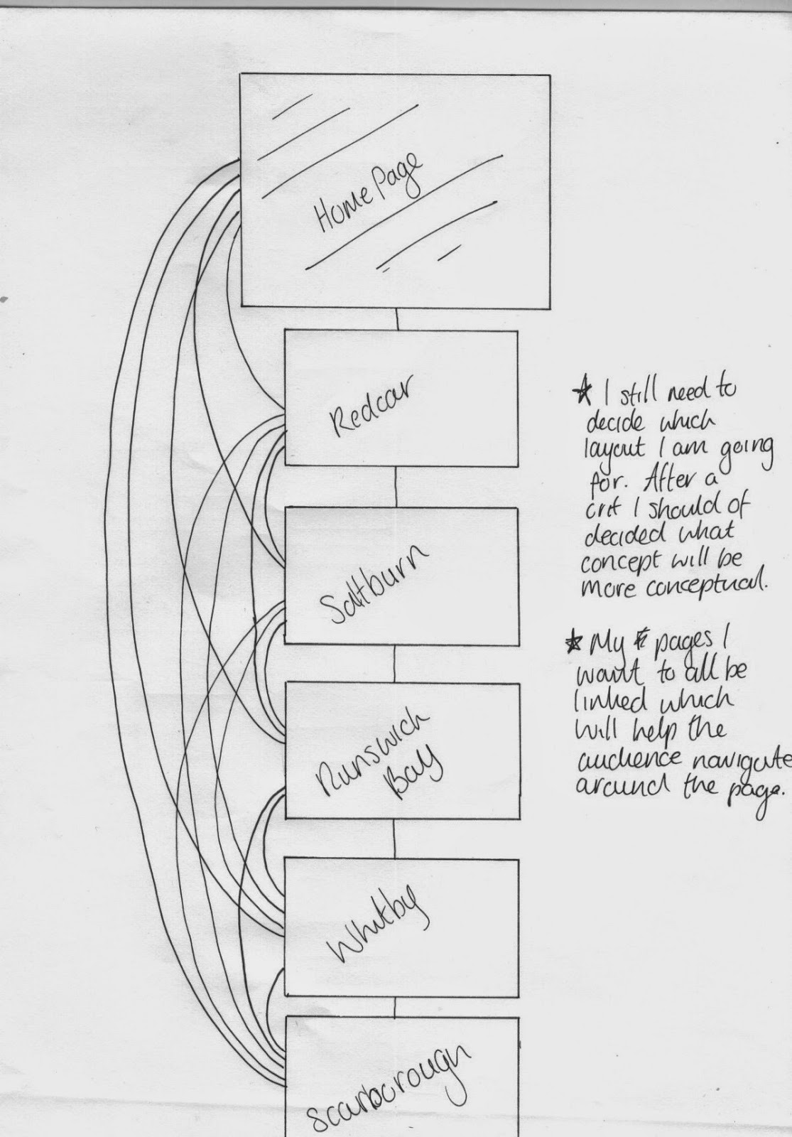
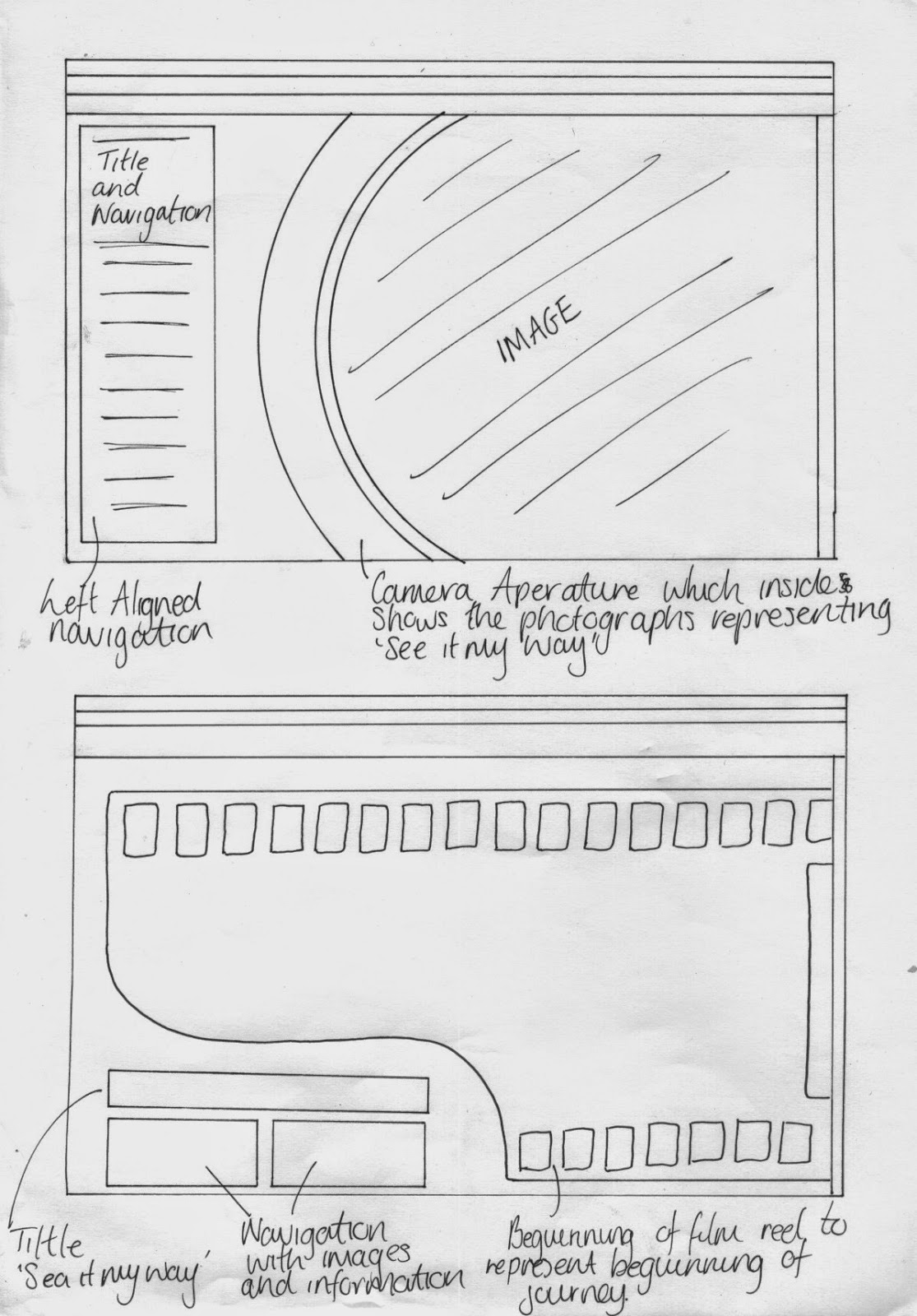

Popular Posts

Search This Blog

Blogger news