A3 Poster
This was an A3 screen printed poster I made. Although the brief demanded A4 sized posters I really wanted to try the larger scaled poster as I thought it would make more of an impact. however when it came to exposing my design I accidentally gave the technician the negative instead of the positive design therefore resulting in my poster turning out to be completely inverted. However after screen printing a few more A3's of this design I started to become fond of the mistake I had made, it kind of reminded me of a demonic version of Bruce Willis in the movie which could relate to his badass untouchable character.


A4 Poster
This is another version I created using an action shot of Helen Mirren. Wearing a camouflage outfit an a huge sniper gun I thought this shot was a good iconic image to use in my designs as its not usually a position you find the elegant classy Helen Mirren in which adds a sense of humour too.


A4 Poster
As you can tell this is a poster created for Morgan Freeman. Another iconic scene in the movie where he sacrifices himself to save his friends wearing this outfit, I thought the minimalistic illustrated design would create more of an impact on the page whilst also keeping the actor easily recognisable by the audience.
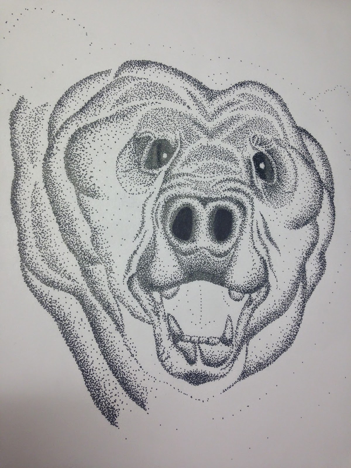

A4 Poster
Finally, the Bruce Willis poster. This I believe is my most strongest outcome as it is the most recognisable and I think the design as a whole flows very well. Bruce having an expression I think reflects his character in the movie that he is a man that should not be messed with. With him being retired in the movie he needed a few lines of his face that represented his age, however I still wanted a stern strong face that showed years of experience and action.


A4 Posters
Here are the posters as a set. I am very happy with my outcomes and think they work well as I set. The only thing I regret is finding more time to draw John Malkovich as he is another main character to the movie and a set of four posters would of been ideal. The minimalistic illustrated look I think makes more of an impact on the red background. The typeface I used I wanted to create an atmosphere of a warning/wanted feeling, how its almost a message to the audience and even other actors you could question that with years of experience these people are not to be messed with.


These are my final designs for this current brief. I decided to go for a minimalistic illustrated based design as I thought it would make the most impact. I used the faces of the most iconic actors with their different recognisable outfits on from the movie so the audience can get a clear understanding who will be featured in the movie whilst also giving a hint of what type of character they will be playing. 


After screen printing our designs onto T-shirts we then had to bake the T-shirts as the prints would come off after being washed which is shown below:


We are very pleased with the outcome for the t-shirts which are now ready to be sold at our charity event. None of us had printed on t-shirts before so we found it quite a challenge and after two solid days of being in the printing room we finally managed it.


 “ The grid system is an aid, not a guarantee. It permits a number of possible uses and each designer can look for a solution appropriate to his personal style. But one must learn how to use the grid; it is an art that requires practice. ” Josef Müller-Brockmann

In our design principles seminar we learnt many key aspects with grid layouts used in todays magazines, newspapers and even websites. Below are examples of grid layouts I found in various commercial and design magazines.


Modular Grid
modular grid has consistent horizontal divisions from top to bottom in addition to vertical divisions from left to right like the example below. The dps consists of a large scaled overlaying image which seems to have no stayed in the grid boundaries, meanwhile the body text is in a 4 column grid which I thinks works well as it keeps your attention and interested in the story as its more spread out than just one chunk of body text. 

Modular Grid
modular grid has consistent horizontal divisions from top to bottom in addition to vertical divisions from left to right like the example below. Below is an example from the Asos magazine. It consists of a lot more imagery, yet still keeps a clean minimal look. It has a few hang lines that break the vertical columns up spread the information around the page.

Modular Grid
This is another example of a modular grid however this is a lot more flexible. It still seems to have a three column grid on the right hand page however the left has images which are not bound in that three column rule. I still think it works well however as it makes the page look more interesting and not overloading your eyes with too much information.

Until feeds sessions I was unaware of the different types of grid layouts you can get in publications and websites. The images above show that I have identified the different layouts in various publications. 


Me and two others in my group began designing for the T-shirts we were producing. My first idea was a turtle as I thought it linked to California where skateboarding was founded. I then changed my mind and thought a bear would be more appropriate as it signifies California:


This is the finished design outcome. I'm pleased with how it turned out and now its ready to be produced on a t-shirt.


- Presentation - 


On the 20th of March we have decided to throw a fundraising event in the university to sell t-shirts to the public and students and raise money for Skatepal. Me, Taylor and Daria have each designed a T-shirt that we are screen printing and selling at the event. 


Here are mine, Daria's and Taylor's designs mocked up on a t-shirt. Next week we are planning on screen printing our t-shirts ready for the fundraising event. The three designs consist of California themed animals, objects and colours, as skateboarding originated in California we thought it was a key element to relate our work too. 

Neil and Jonathan created the posters that will be used to promote our event. I created the Facebook page and Daria created the Twitter and Instagram for our company. This was to promote and help our campaign go viral and reach people around the globe. 

This is a mock up of the packaging, labels, posters and t-shirt. We went for a clean and minimal look to make the brand easily recognisable and to the point as were just starting off. We are intending on rolling the t-shirts up in the printed tracing paper and wrapping the label around the outside.


Finally to conclude our fundraising even we are also throwing a competition along side of it. When people purchase the t-shirt at the event the label that comes with it will explain what entails in the competition. The person has to take a picture of themselves in the t-shirt, hashtag #Salt&Sauce and upload it onto Facebook, Instagram and Twitter where they will be entered into a competition where they will be able to win a limited edition designed t-shirt, screen printed socks and a sticker pack.


- Branding our campaign - 


This is the name of our charity campaign. Salt & Sauce was one of the many branding names we came up with but thought this was the most catching. The Salt & Sauce refers to the each of us in our group coming from different parts of the UK and how our different cultures have salt and sauce on our chips from the local chippy. The more we discussed about the concept of salt and sauce the more we understood how different parts of the UK produce different and better flavours of sauce such as brown sauce, gravy, garlic and curry. To conclude this name we decided that the the opposites of salt and sauce and how they are brought together for flavour would reflect the purpose of our company which is bringing designers and charities together. We found that many students such as ourselves do not really bother much with charities which our aim is to change, hopefully designing merchandise for this charity and selling them at a fundraising event will help students and teenagers become more aware of charities and that their money could go to good use whilst also benefitting themselves as many of them do not have spare funds to put towards a charity.

This is the logo that we all agreed was the most strongest. It is simple and to the point, it reflects and shows the whole 'Salt & Sauce' contrast with part of the S being filled in white to represent sauce whilst the other part is a dotted line to represent salt. The colour scheme is to reflect the whole California scenery as thats where skateboarding originated. 


This is the packaging design that Neil and Jonathan made. Our intentions are the print this onto newspaper or tracing paper to relate it to the whole fish and chip wrapping up in newsprint style. We thought this would be a unique and fun idea to use on wrapping up our t-shirts, for the fundraising event.

Neil also made this banner for our facebook page. It clean and minimal which lets our company be easily recognisable.


- Plan -

Plan:
-Social Media:
The social media sites will be updated with the new logo and also the cover image (used on the presentation)
- T-shirt designs:
Myself, Daria and Taylor. We will create one design each to be printed onto 'One Size Fits All' white polo neck tops. We will have at least one to show for Friday (the final crit/presentation).
- One main design on the front (screen printed)
- Our logo screen printed on the bottom of the right sleeve
- SkatePal's logo screen printed at the bottom of the left sleeve
(Tags with our logo and details of the competition (picture in the top posted to the internet) and also our information to the social media- This will be done by Johnny and Neil).
- Logo:
Neil and Johnny have decided to re-design the logo using the colours from the presentation (black, white and blue C:40 M:15 Y:0 K:0). These colours will run throughout our company branding.
- Promotional Material (Posters)
Johnny and Neil will also design these. The posters will be in select areas of the university to promote our company, the work that we are doing, the charity (SkatePal) and also to advertise the details of our stall and products on sale.
- POS
We would like to add extra touches linking back to the 'Salt & Sauce' idea. Just like in a chip shop we will wrap the t-shirts up in newsprint (patterned with our logo) and then place them inside of our branded bags. These will also be small keepsakes for the customers and reminders of the company. This would advertise us.
We thought about using printed tote bags rather than basic paper ones. The paper bags would be cheaper to buy, easier to print yet they aren't as durable (if it rains for example). They could only be re-used a few times before they start to tear and break. Whereas the tote bags could be re-used and promote our company/brand a lot more effectively if used more than once.
After looking at the pro's and con's we have decided to stick with using paper bags, yet if we have sufficient funds left over we could print the tote bags instead/as well as. Whether we use these as something to sell or simply something that you get free with a purchase would depend on the cost.
When & Who?
- 1st stall: Interview week (Monday 10th March): Vulnerable influential new students.
- 2nd stall: (17th March: Decide on dates/all week) To uni students/anyone who hears about us
Where & How?
We will choose a corridor to set up our stall. We will have to look at which would be the most successful and have the most passers by (maybe near/in the canteen?)
We will have to speak to the health & safety officer about our stall (where and what will be on it).
Timetable:
Monday 3rd March:
11AM - 12PM : Have T-shirt designs and logo done ready for a crit to improve them.
Tuesday 4th March:
1PM - 2.30 PM: Meet to show very final designs for logo and t-shirt designs.
2.30PM - 3PM : Invert designs on Photoshop and print out.
3PM - 4PM: Prepare screens for screen printing.
Wednesday 5th March:
9AM - 12PM: Screen print main design onto the front of the T-shirts (1 of each design at least). Digitally print posters. (Video process to upload to Twitter, Facebook and Instagram)
1PM - 4:45PM: Print logo's onto sleeves (SkatePal and Salt & Sauce) and pin up posters around uni.
Thursday 6th March:
9AM - 10AM Take promotional photo's of merchandise
10AM - 11 PM: Edit images & 'process video'
11AM - 2PM: Create a thorough presentation for crit and mount posters & borrow mannequins for t-shirts. Post 'process video' to all social media & promote the stall for next week.
2PM - 3:30PM: Run through presentation and make notes to prompt us (ask someone to watch us to make sure we have included everything).
Friday 7th March:
9AM - 9:30AM: Make sure everything works (presentation) and we have everything perfect.
9:30AM: Be ready for final crit/presentation
Additional Work (If We Have Time:
- Laser cut key rings (logo)
- Print logo's onto bags (paper or tote?)
- Print Logo onto newsprint


- Research - 


Creating and branding our own merchandise campaign:
Our first an most strongest idea was to create our own merchandise for Skatepal and sell them at a fundraising event to raise money for the charity. This seemed the most practical and interesting idea as our target audience is mainly students and teenagers, also skateboarders. All people who would wear T-shirts with designs on. Another idea to support this campaign was getting people to donate old neglected skateboards so we could renovate and put designs on them to bring life back into skateboarding, the whole principle of skateboarding is to have fun. It brings communities together and helps people express their personalities and creativity which is what we would want to emphasise in the design.


Using shock ads/videos to make the public react:
This we thought was one of our weaker ideas however we wanted to see what our peers advised in the interim crit. This idea was to use shock advertising and capturing the reactions of the public on video which will capture and interest them to look further into the charity it is promoting, hence raising more money for the charity.


Sympathy/Humorous video to gain attention:
As you may have seen there are many neglect videos of children or animals such as dogs that really play on the publics conscience to get them to support and help the charities. We thought by linking Skatepal again we could video a skateboard abandoned by the side of the road, or just rolling along the street alone to show it has been discarded and has no owner. This could be quite humorous yet sympathetic because so many things in todays society get discarded so easily, the video would be to influence people to show more love in the things they own and hold onto them for as long as possible.

Interim Crit feedback:
The feedback for the crit was a lot what we expected. Our peers and tutors advised that the first idea was the most practical and strongest. The others would be too time consuming as we have quite a small time limit at the moment to get the brief done. So now we are planning on designing three different types of t-shirts, packaging, posters and labels for the t-shirts to all sell at a fundraising event held in the university. The money will go to Skatepal to help and support the organisation and continue their work on helping young Palestinian children get together and learn how to skateboard.


Popular Posts

Search This Blog

Blogger news