- Experiments & Development -


I then began to print out examples of the typeface Garamond. I started off with the letters A, B and D as I wanted to try a letterform with no bowl and structure (A) and two other letters that had Counters and different types of Bowls (B,D). I tried regular and bold to see which one would work best for experimenting with using the word Anatomy. I then got some tracing paper and worked over the top of the letterforms and tried visually representing veins, muscles and bones.

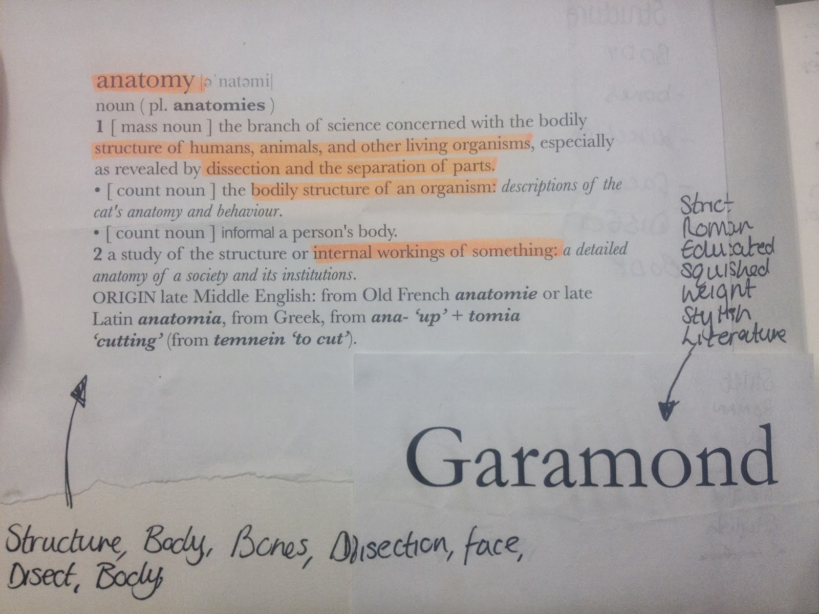
These are examples of 10x10 Garamond letterforms I printed off to help me experiment with different elements and manipulations to portray my chosen word Anatomy.

This shows an example of a block colour letterform and a outline of the font Garamond. I decided I did not want to manipulate the actual typeface itself as the serifs would be a good element to experiment with bones and muscles giving it more of a realistic character.


These examples in my sketchbook are my initial first ideas and designs. I tried to manipulate the crossbar in the A and found it did not look appropriate or portray Anatomy. The image below however I experimented with the muscular forms in the human body, trying to replicate how the muscles are form and making it look realistic.
Although, I did try one letterform with colour which I thought look terrible and did not work at all. It took away the focus on the detail of the muscle which is not what I intended. I chose to stay with the black and white contrast the making a bigger eye catching impact.


These experimental designs were a lot more successful as I started to get an initial idea of the look I wanted to go for. I tried bones, intestines, muscles and even the inside of veins of what blood would look like underneath a microscope. I really like the attention the detail draws and makes you think what it actually is in a subtle but obvious way.


These designs were my most successful as I mainly used bones and muscular elements of the human body. I found that the bones worked best on the brackets on the serifs making it look almost like feet. The muscles also added depth and definition to the letterform.
FINAL OUTCOME


FINAL OUTCOME


Self Evalutation
Through my research and experimentation I believe the final outcomes I produced communicate visually the definition of the word Anatomy very clearly. Using different parts from the skeletal, muscular, nervous and digestive system I have used a more obvious approach working with the letterforms. There is no use of colour in my finals as in one of my experiments I found that colour took away the focus from the detailed and defined illustrations. The black and white work well together contrasting with one another to making a more eye catching interesting impact.
However I am not happy with the paper quality I used to draw my designs on. I used a very thin weight so it was easier to trace onto but making the designs look very flimsy and not professional. To improve I would like the scan in my designs and digitalise them further to see what other effects I could do and also print them onto better quality paper.
Feedback
Successful at communicating the word Anatomy through the illustrations inside and on the letterforms. The top first two worked best and were most successful and they were not constricted by the outline of Garamond.
Consider researching into present day use of skeletal typefaces such as Topshop and Halloween stores.