- Finals - 


These are the finals I created for the given brief. I chose to use imagery from a photographer called Murad Osmann and edited them further in photoshop. I added noise to the photographs to make them look more like prints than just digital images. I chose to use these photographs as I thought they were a lot stronger at communicating travel and experiences as it shows some ones experience from their own eyes. I tried to match the text and triangles to the main colours within the photographs not to draw too much attention away from the images themselves.


- Evaluation -

Overall I have thoroughly enjoyed this module. I have found it challenging yet informative as I have learnt many new things within the 6 weeks of being on the course. The first brief I found a challenge at first trying to get primary and secondary research and understanding exactly what I needed to find out, however once I got an initial idea of the look I was aiming for in my 10 letterforms the experimentation and development was a lot more fun.
         The second brief was also linked to the first brief as I had to chose the most successful letterform from the 10 I had created, create the rest of the alphabet using the same style as that letterform, then digitalise it on illustrator. As in the first brief I had to reflect and represent the definition of Anatomy through the typeface Garamond I chose quite a sketchy hand drawn look for my letterforms, therefor when it came to the second brief I mainly used image trace as I thought it was the best tool to digitalise my letterforms whilst also keeping that hand rendered element.
         The third brief we were partnered up and had to learn different elements and characteristics from their personalities to create a font based entirely on them. Jake my partner gave me a lot of information about himself; such as the movies he watched, music he listened too, fears, happiness and memories. This gave me a good idea on what to research. I found that my research consisted mainly of bold san serif typefaces from the movie posters and album covers from his favourite movies/music. I then experimented and developed from this research giving me good ideas on what I look I wanted to go for.
          The fourth and fifth brief were also closely linked as brief four consisted mainly of researching from an article in a newspaper and finding out in depth research about the story. Brief 5 was using the research to visually communicate my opinion and what I found out about the article itself. After reading the story and doing my own independent research I found that the story itself was either extremely exaggerated or fabricated because there was no initial facts to support the story, this made me want to create three controversial posters that would create a bold impact on the public eye.
           One of the main elements I have enjoyed from this module is the professionalism and attitude from my tutors and peers, I have never been in an atmosphere where the majority of people actually care about design and want to work which is really motivating. The briefs are challenging yet fun and also very interesting, I learnt about the terminology of typography in college however not in this depth and detail which I think makes it a lot more intriguing. I have discovered how easy it is to use the digital print room, library, access the screen printing room and mac suites which I am relieved to know about as I feel I have a lot of resources to help me with future briefs.


I am really happy with my outcomes with this project. I believe I have communicated my messages well through the different posters I created. In the final crit feedback my peers thought that the image and type based poster was the most strongest at communicating my message. The image based poster however still was a lot weaker and people still got a little confused at to what the message was. I was advised to changed the little characters and have them look more like puppets instead of just dangling from the spider which would communicate more of a mind control message by the media.


- Final Outcome -


This is the final outcome for the illustration brief. I am really pleased with the outcome and thought it communicated anatomy successfully. The paper I chose to print on was a thick, cream coloured card as I wanted quite an earthy look as the texture would add to the letterforms. My letterforms are mainly hand drawn and digitalised so I thought this paper would be most appropriate to keep that hand rendered sketched look.


- Development - 


I began by creating my spider in illustrator using the pen tool. This was fairly easy although it did take me a while to get the legs right. I then painted it in solid black to create a 2D block effect,
I then began by adding the typeface underneath. I used Futura as after researching various newspaper typefaces I found this was the most appropriate. I chose the colour red to highlight 'Newspaper' as I wanted to draw attention to the fact its the newspapers that I was focusing and communicating in the poster.


I then used the pen tool to draw what looks like webs from the spider to give it more of a tangled/caught effect as the type is asking the public a direct message. This I thought worked successfully as it draws attention and makes you question the message behind it.


I then got an outline of the worldwide map and coloured it in white. I then put it over the back of the spider to contribute towards how the spider is a symbolism for the media and how they manipulate and control the world by fabricating lies for money.


- Type Based Poster -
I started off by using the same typeface as my image & type posters so it would work as a set or series. I again used the colour red to create an element of alert and warning.

I then added 'don't get caught up in lies' at the bottom to look fairly subtle and not draw too much attention. I thought this made a short but information message and portrays the media lying to the public well.


- Image Poster - 
I firstly created these characters using the pen tool in Illustrator. I wanted them to look like they were hanging as my idea was to have them dangling from the spider that I used in the first poster. I again painted them a solid black to keep it minimal and not over cluttered.


\
This shows the development of the poster. I used the spider and the worldwide map I used in the first poster as I thought they were strong at representing the media and how they have the public caught up in their web of lies.


- Design Principles -


In this session we had to present our experimented typeface families. Our task was to use the typeface we printed out and make them into bold, light, italic versions and show our understanding of the different elements in the terminology of typography, we also had to try and push the boundaries on the fonts legibility. Mine had been cut away using a scalpel creating different weights amongst the letterforms so I found the task a little difficult to get used to especially the italics.


- Development -

I began with the letterform A from brief 1 as I thought that this style was more successful at representing the definition for Anatomy. I then scanned it into illustrator where I was able to digitally enhance it further.

This is an example of how I manipulate and digitalised my typeface.


I mainly used the live trace tool on my letterforms as they were quite messy and complex, it would of been too hard to replicate them entirely digitally using other tools such as the pen tool. I selected the letterform then once I clicked live trace I opened the menu which allowed me to change different settings and get the desired look I wanted.


This is the digitalised look after using the live trace tool. I played about with the settings until I got this effect which I think works well as I wanted to keep it looking hand rendered and sketched but cleaned up and digitalised. I wanted this look as I thought the shadows and joints help visually communicate bones which is what I needed to portray to complete the brief.


I then used the same tool on the rest of my letterforms which as a set turned out good. I am pleased with the outcome and excited for it to get printed.


- Interim Crit Feedback -

The feedback I was given was a mixture of both positive and negative which I was pleased about because I had hit a wall when creating my final designs. I was advised to make my image based poster more clear at communicating my message; one of which was to make it look more like a cob web and not just strands attached to the characters. I also changed the heads of the characters and the spider to link them together to portray how the media gets into the publics head with their lies. 

Another comment on the type poster was to not have the type running off the edge, however I disagreed with this comment because I thought it represented the continuous never ending spin of lies that the media publishes, it almost looks like a conveyer belt which could reflect the mass production of the newspapers.


- Experiments & Development -


These two examples are the first initial ideas I had for my type & image poster. I thought I could either draw or photograph a person then manipulating them by adding illustrations to look like webs and spiders. The spiders and webs were supposed to symbolise the media and the person symbolising the public and how the public get caught up in the medias lies; brainwashed almost. The type I thought could be either subtle making the main focus on the illustrations or bold and san serif to make an impact drawing instant attention.


These are a set of experiments I had for the image only poster. The first experiment I thought using the same typefaces different newspaper use could make a big impact and create curiosity as to what exactly is going on in the poster, making a subtle yet informative response on how the media fabricates lies to sell stories. The second I thought the sentence was quite catching and to the point, I want to try a simplistic san serif typeface as I think this is one of my stronger ideas on portraying the media to sell the public lies. It also relates to my False Widow article with the 'Spinning' reference.


These two experiments are mainly image based ideas I had. I wanted the spider to represent the newspaper companies and how they have many legs branched in different areas of the media to control and brainwash the public into believing and buying their fabricated stories. However I found this was unsuccessful because without the typeface in the web it would be hard to communicate my idea. The second one again was to represent the same idea as the one on the right but again would not communicate my message without the typeface therefore this was my most unsuccessful experiment.


These two were more experiments on my image only poster. I quoted words from the newspapers that were used to describe the False Widow; "terror, attack, aggression, bite"and used a line to cross them out, this was to portray that the media is wrong about False Widows and have completely glorified them as aggressive deadly spiders in the newspapers recently.


These are two more examples I created for the image & type posters. I think these are the most strongest at communicating my message. I used the spider with the worldwide mad on its back to represent and symbolise the media and how it is in control exaggerating and publicising lies to the public to sell stories and make money. I want to try develop the one on the right digitally to see what effects I can achieve and if the message communicates successfully.


- Session 3 -


From last weeks session we had to then find 6 different examples of typefaces that have all originated from different bases such as: Stone, Brush, Bone, Wood, Metal and Silicon. We were then assigned a task to chose one typeface ready to be manipulate in some way. I chose a wood based typeface as it was the most clean and simplistic and I thought it would be interesting to see what effects I could do to change it.


I used mainly a scalpel and cut away one stroke on all of the letterforms. This I was extremely pleased with and thought it looked successful. I also even like the grey table coming through where I cut away the letterform as I thought it had a 60's retro influence. 


Our task for next week is to trace these letterforms and create a typeface family of regular, bold, lite and italic.


- Design Principles -

The task that was set the week before was to get both upper and lowercase of ABCXYZ with distinctively different characteristics. I chose Times New Roman, Lavanderia and Walkway condensed. This gave me a good initial idea of the differences between typefaces.

We were then taught the different origins of 'type' and where they were all based from: Stone, Brush, Sable, Bone, Wood, Lead, Silicon and Metal. I was then put into a group where we had to choose one font from our typefaces and decide which base it originated from and form different categories.


This is the final typefaces that have been put into categories from which they originated from. From left to right: Stone, Brush, Bone, Wood, Metal and Silicon.

- Session Notes - 


- Design Principles -

Evidence - 
  • Portfolio Work - Visual language, drawing and visual investigation.
  • Set of notebooks, sketchbooks, resolutions, practical and conceptual development.
  • Online critical journal.
Task 1 - Need to bring:
  • A  B  C  X  Y  Z
  • a  b  c  x  y  z
   From three different fonts with distinctly different characteristics.

   Printed and cut into individual 10x10 cm squares.


Books - 
  • Ambros and Harris
  • Pocket Essentials


- Final Outcome -


This is the final outcome I created which I was extremely pleased with. The typeface is bold and san serif which is the look I was aiming for. There are subtle changes to the typeface such as the corners have been rounded on all the letterforms and glyphs, I removed the crossbar on the A to symbolise camping as this is what my partner loved doing the most. The J has also been slightly been manipulated to represent the fin from a shark as that is my partners most greatest fear.

In the main crit my peers thought it was successful and linked to my partners personality through my research and questions. They also liked how subtle and changes were and that the typeface could be used as body text and as a header. However one criticism that I agree with is that the A did not flow with the rest of the letterforms as its the only one with the crossbar removed. I was suggested to try the typeface in sentence to see if it still stood out as my name badge did work more successful in a word.


These two screenshots show the process and manipulations I created on photoshop. I mainly used the pen tool to trace over the White Space typeface and round off the corners to give a more relaxed easy going outlook as this is one of the main features of my partners personality.


The two images above show the digital versions and grid layout I positioned my typefaces on. I decided to go for a basic structure layout as my partner loves organisation and structure. This I thought worked very successful and was exactly the look I wanted to achieve.


- Experiments & Development -


These two scans are the first initial ideas I had when I came to experimenting, I brainstormed different ideas to see how successful and appropriate they were and if they could be developed further. 


In my interim crit I got a lot of feedback. People liked the direction I was going with the experiments however some did not quite understand the concept and idea behind the letterforms. As I only had experiments with three letterforms to represent my partners personality my peers thought it make be too inappropriate to create all 26 letterforms representing each and every element of my partner. I decided then to take more of a subtle approach on my typeface and have more of a broader outlook.


I began by researching into my partners favourite movies and viewing the posters that were used to promote and advertise them. All movies produced a similar block san serif typeface which made a significant bold impact so I thought it would be a useful element to use in my experiments and see what works.


I was also recommended Font-smith for typefaces and after researching the different fonts they had on offer I selected three I thought were most appropriate. I then tried to re-create them myself to see which one was most successful and appropriate for my partners personality. I chose to work with White Space and Easy as I thought they were most successful, White Space was bold, tall and well structured which relates to my characters appearance and character as he is tall and likes structure. The Easy font I thought linked perfectly as he is quite easy going and laid back which the type shows in the soft slight curves.


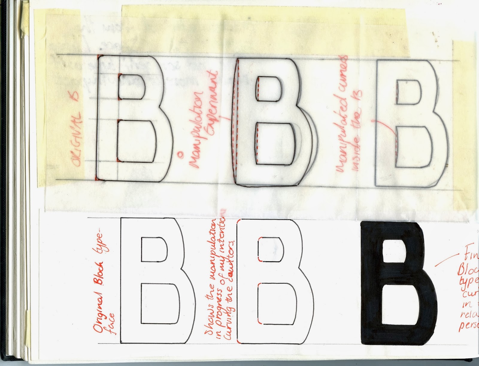
I began by experimenting with a letterform that had counter spaces and a bowl. I traced and experimented with the B to see what different elements I could manipulate to get the desired effect I wanted. I chose to make subtle changes such as rounding off the corners on the outside and inside of the B as I thought this looked most successful.


I then chose to work with a letterform that contained a crossbar. The T was a perfect example as the crossbar is a main element that makes it an obvious T. I again rounded off the corners of the crossbar to make it look a lot more relaxed which was successful.


I then decided to work with the A and see how I could portray my partners personality through the letterform. I decided the take away the cross bar as through my experimentations I thought it was most successful as symbolising camping which is what my partner enjoys doing. I again rounded off the corners making subtle changes which I thought was appropriate.


Popular Posts

Search This Blog

Blogger news