For the type for my website I decided I wanted to go for a striped look as thats what seasides used to feature back at the peak of seaside tourism. Pastel and stripes were recognisable at a seaside so I thought to do type that is similar would be appropriate whilst also looking nice. I chose a chunky san serif type that is not too in your face but you can imagine it being at the fish shop on the sea front. I drew lines and masked them over the top of the type where I then had to use to eraser to get rid of unwanted bits.


Playing around with different effects on the type helped me get exactly what I wanted, I played around with the lines and drop shadow on the type. 


Adobe Photoshop CC

Shift from RGB to CMYK photoshop pulls it to the nearest line, this makes it look duller.

Why don't we always work in CMYK?
The default mode photoshop works in is RGB, some features can only be applied if in RGB mode. When you work with CMYK files they are much larger.


Gamut


Grey areas show where the colours are not printable and will be printed different colours. If we convert to CMYK Photoshop will pull those colours to make it printable.


Adjusting the hue/saturation, brightness/contrast, levels etc it will get rid of the grey gamut and lets you adjust the image to see what its will look like when it comes to print. If you don't adjust this the colours will print out differently to what you see on screen.

Proof colours - Shows how the image will look when you convert to CMYK but the mode is still in RGB.

Work in RGB mode until you finish editing you image. Then convert the image to CMYK mode and make any additional colour and tonal adjustments. Especially check the highlights and shadows of the image. Use Levels, Curves, Or Hue/Saturation adjustments layers to make corrections. These adjustments should be very minor flatten the file if necessary, then send the CMYK file to the professional printer.


Holding down alt and clicking on the swatches on photoshop will delete the swatch. Save the swatches with one colour (black) so you have an empty swatch palette for the future.


Replacing swatches lets you load any other swatches that you might have saved, including the 'empty swatch'.


Top box with triangle means the colour is not printable, by clicking it photoshop will chose the closest colour that is printable. The box below is for web safe colours and by clicking that photoshop will convert the colour so it is web safe.

Save Swatches for Exchange - Saving a palette to use across different pieces of software.


When using a spot colour I always need to see the reference number.

Duotone


Duotone can only be applied to greyscale

Duotone is choosing the inks that are going to be printed, in the process above you can see that I have changed the black spot colour in the image to blue.


Making the Duotone Type from Monotone to Duotone lets me add another colour, this adds more depth to the image. It appears less flat and more stronger.


Adjusting the curve of the inks. Lets me control how dark and bright I want the ink to be on the blacks of the image.

Printing with more inks will cost more, consider what inks I am going to use. 

CMYK - 4 Inks
Monotone - 1 Ink
Duotone - 2 Inks
Trio-tone - 3 Inks

CMYK + Duotone = 6 Inks (bad as this will cost a lot!)

Creating a new spot channel


Creating a new channel on the grey image. Choosing a colour lets me draw on top of the image which the colour will then show, but effects the greys in the image. The colour is overlayed as it represents the transparency of the inks.


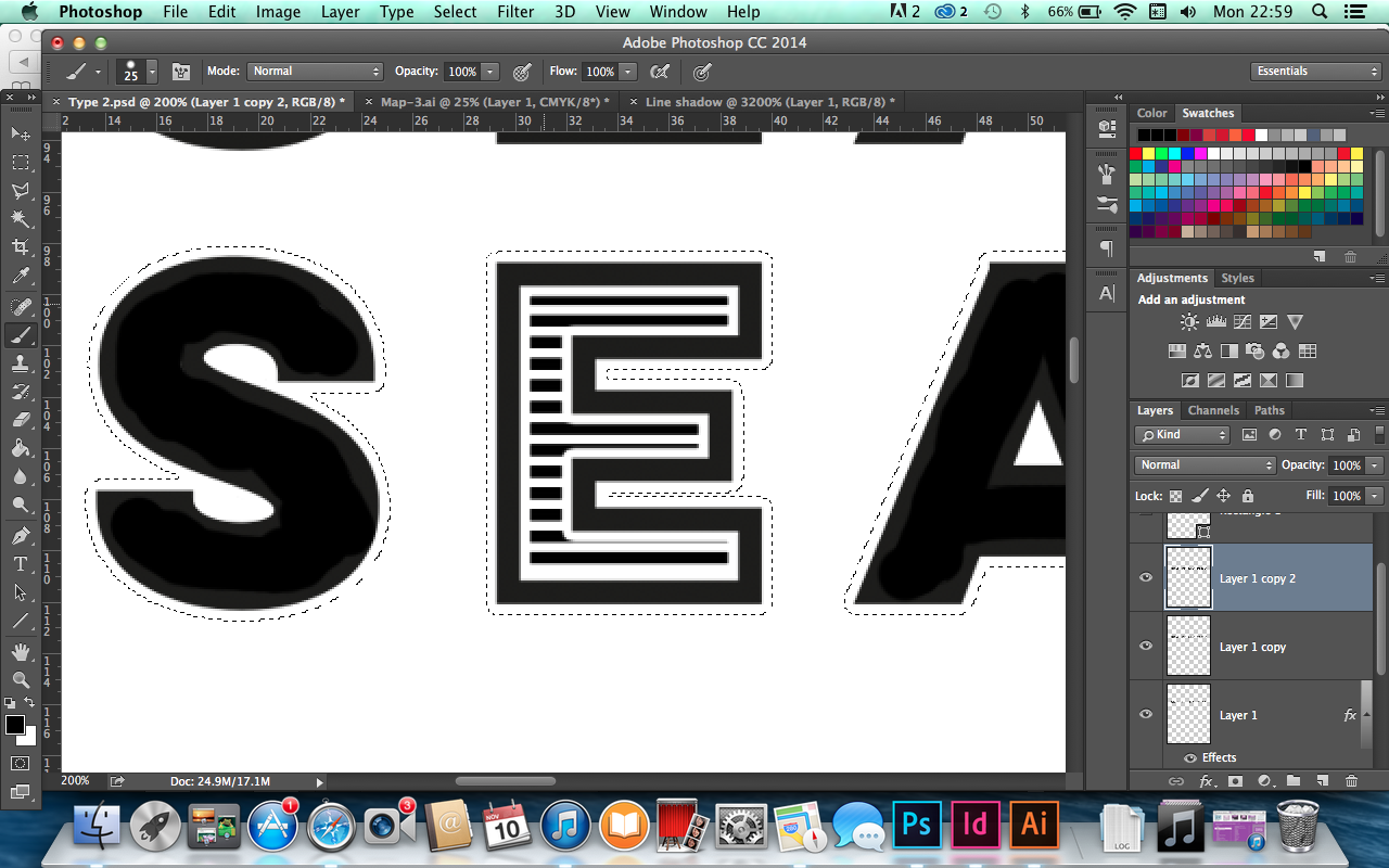
Adding text will use the channel and show the ink inside the text.
Solidity - As we are working with a channel it appears on screen how the ink will be during the printing process. It appears as transparent. Printing inks themselves are already semi transparent (CMYK). Solidity is to do with how opaque or transparent an ink is.


These are the mock ups for the website I am creating. For my summer brief I chose to venture out and  discover old seaside towns history and document what I find. Although I have not put content into the mock ups yet I wanted to just design the layout to get a better understanding of what it will look like. The front page consists of many vector graphics, the different seaside resorts will be interactive on the map so when you hover over the name it will be highlighted. To the left is more of an introduction to the website to tell the audience what its about. Depending on what town they click on they will be transported to another page where there will be photographs and information on the town they have selected. I want to try and keep it short and sweet mentioning the local history and attractions whilst giving up to date photographs to show how the seasides have declined or benefitted from the tourism over the past 100 years.


This is the original map I started off with before I traced over the top for my homepage.


I mainly used the pen tool on Illustrator and wanted to create a rough but not sloppy looking vector image of the map. The colours I think needed to suit the theme and be pastel colours but still vibrant to be suitable for my target audience. It is also relevant because the seaside has quite be achy pastel looking colours so I think its appropriate.


I firstly tried representing each down with their own little icon. I thought this might look minimal and have a nice effect however because some of the seasides start with the same letter this may be confusing to the elder target audience.


I also tried with more of a solid circle shape to see if it improved the look of the letters however this failed.


I then started to play around with text and positioning them into speech bubbles as though the website is speaking directly to the audience. I think the type and speech bubble works well and is understandable. It also gives information on other places in the north-east to get a better understanding of where a bouts int he UK it is.


I also tried different coloured speech bubbles to get more of a seaside colourful feel but found this looked too messy and didn't like the affect it had.


I also tried the blue background but found it blended into the background too much and might not be legible for the viewers. I decided to stick to the white background as I thought this worked well and was legible enough for elderly and parents to see without looking too over the top.


Search Engine Optimisation

Search engines use algorithms to assess the suitability and ranking of websites based on search items.

Algorithms differ for each engine and are constantly updated as the web develops and grows. It is a way of making alterations to websites according to the criteria that search engines uses when 'crawling' web content.

Page authority refers to how likely a web page will be ranked in a search based on SEO optimism, internal linking and content relevance.

Domain Authority refers to how likely a domain will be ranked in a search based on age, popularity and size.

Factors that affect search engine ranking:

On the page factors
- Content
- HTML
- Architecture

Off-the page- factors
- Links
- Trust
- Social
- Personal

Violations
- Irrelevant/weak content
- Spam
- Paid for link


Web Design Style

Colours: Background/foreground

Font Families: Header and body

Button style

Logo and Variation

Grids/Layout/Variations/Sub page

I have organised my web brief into a style sheet to get all my essential considerations and ideas down. Starting off with type I have selected a small range of type I can play about with on the website and see what works best. I want to go for a clean minimal look which is easy to understand to all viewers, as my target audience is mainly the elderly and parents it needs to be clear and straight to the point.


These are the chosen fonts I selected which I thought would be appropriate for body text and header on my website. I think they are clear and legible and could work on my website, whilst they each communicate different things I need to chose a suitable font out of my selection that I can start to experiment with for my website.


I then went onto illustrator and tried out different swatches of colour for my website. I thought something pastel yet still vibrant would be suitable and give off a seaside atmosphere. However I do not want something too bland as I want the page to be atheistically pleasing to the eye and exciting enough to keep the audience interested. I do have to be careful which what colours I select and if they go with the photographs I have gathered for the website.


These are the selection of photographs I have chosen for my large folder of images. There was far too many photographs to put on the website so I have tried to condense it down to twelve images which shouldn't be too much for a webpage to handle. Each seaside will have its own page which will have 2/3 images of that seaside. The photographs I have chosen contain excitement and interest as they each communicate something different from the different seasides.


Here I have tried to digitalise the layouts I have experimented with. I thought if I tried it digitally I would get a better look at how it looks on screen. This layout I'm not too fond of, the only reason why I developed it was to see if on screen it did not look as cramped as my scamps did. The left and right rectangles would be white space concentrating most of the information to the center of the page, this I think looks too cramped and the information would confuse the users.


This layout I think is one of the most successful ones I have developed, although it is very simplistic and minimal it needs to be so my target audience can easily navigate around the website without too much information thrown at them. As my summer brief mainly consisted of photographs I think a minimal layout with clear imagery will communicate my message and connect with the viewer as though they are looking at things from my point of view.


This is another layout I had developed, I think its another strong layout as it is still minimal and simplistic which will make it easier for the viewer to navigate around and see the information clearly. The heading is at the top left aligned with the body text below, the rectangle to the right would either be imagery or a map of the north-east of the UK. Both things I am considering doing because I want it to be straight to the point as soon as you hit the first page.


Designs for Print

Considerations for preparing digital artwork or layout that will be commercially printed

Adobe Illustrator
Adobe Photoshop
Adobe Indesign

Commercial Print

Offset Lithography - Mass Production
Digital Print -
Screen Print - More of a hand rendered finish

Digital Colour Modes

CMYK (cyan, magenta, yellow and black)
subtractive colour, ink on paper

RGB (red, green, blue)
additive colour, light via monitor, projector etc

CMYK mode is used to define colour as it is when created during the printing process

Sometimes referred to as Process Colour

Inks are a little transparent so overlaying of CMYK colours with create different colours

We need to think of Colour as Ink

Swatch Pallette -  More consistent colours easier to use when using multiple things that need the same colour and to also create your own swatches


Registration - Line each colour up in the printing process


Add Used Colour - Creates a swatch for every colour found on artwork.

Global Swatch - Tints of process colours


The global swath links other swatches where applied therefore if you change the colour of the swatch it will change all swatches with that colour.


Spot Colour/Spot Ink

- During the print process another ink used.
- Ink already mixed.
- Number of inks used are cheaper.
- Economic reasons/financial considerations
- Consistency of colour
- Pantone reference system (pantone colour sample booklets)
            - Tells printer exactly what colour to print.
            - Very efficient and consistent
- Accuracy

Saving Swatches to another illustrator file

Save swatch in library Ai. 
Where its going to be saves -> Swatches
Open Swatch library -> User defined

For Photoshop save as ASE (adobe swatch exchange)
            - Do not save file in the same illustrator swatch folder.

For InDesign save as ASE in folder as content for InDesign.

Process colours 
Printed using a combination of four inks.

Global Swatches
Automatically updated throughout your artwork when you edit it. 

Spot colours
Ink that is used instead of, or in addiction to, CMYK process inks.


Popular Posts

Search This Blog

Blogger news