I quickly mocked it up to give it more of a realistic feel. Unfortunately I did not have the money to print this out on the stock I wanted, however with more time and money I would have printed on a nicer thicker paper and had the design in a metallic foil.


These are the final outcomes I submitted for a christmas card competition being held at Leeds College of Art. After endlessly trying to get a grasp on hand rendered type I found this quite challenging. I'm not particularly fond of the outcome and I know I've done better on previous briefs that involved hand rendered type, however with the time frame I had this is the best I could do. I've tried to smarten it up a little with a paper texture and a inner shadow to make it look less flat. 


Originally I had wanted to print onto the cards using a metallic foil for the design on a crisp paper background. But unfortunately I did not have the facilities or the time to do this so I had to submit as it was. I unfortunately did not win this competition but it did not surprise me compared to the other fantastic designs that were submitted. I would say this is one of my weakest briefs and I think it could have been drastically improved if I had been given more time.


Pinterest:


These I thought were more atheistically pleasing, I really like the use of hand-rendered type as I think its has nicer effect and just makes it a lot more informal and friendly which supports the christmas spirit. It is definitely something I am considering to do in my own experiments and ideas.


This design I think is great, however the type is not really that legible. The second S in seasons does not need to be capital and I think it throws off the whole design. The way the type is layer out and drawn I think works well though and is definitely something I am considering doing in my own experiments.


These different designs I found on Pinterest. As I want to try hand rendered type these designs really help me get a better idea of how I wanted the card to look. I'm thinking of using lyrics from a song on the front of the card that everyone will recognise instantly. This I think would instantly draw attention and make an impact. I found that the hand rendered type had more of a home-made feel which works best at christmas when its a time for family to be together, makes things, play games and give gifts.

Behance:


These set of cards I think are just fantastic. The cute vector based animals work well, the colour schemes and layout work well, it doesn't look too overcrowded whilst keeping that hand-rendered effect which I think is the strongest element. This is something I am considering doing in my designs however I might just stick to type for now as I am not sure whether I would have enough time to cover animals and type.


Carli Alexander:


Another set of very nice cards. Again like I've mentioned before there is something so much nicer with the cards looking hand-rendered than just a digitalised font. I really like the look of the stock on these set of cards as I think it adds to the hand made effect. The type is legible and not too in your face whilst still keeping a professional look to the cards. I need to consider what type of font I want to use for my card then I can work into it.


This is the design I eventually submitted in for the feathr brief. At first it was getting a lot of high votes to the point where my design was first on the popular page which was such an achievement for myself. I thought the design was quite daring and unusual, after doing crits and getting feedback it often left people staring at the design trying to work out exactly what it was, and how I created it which is exactly the response I wanted. The bold colours can be seen as unsightly but the design creates depth and shape distracting you from the harsh colours. I initially wanted the wallpaper to feature the design as a strip which filled the wall from ceiling to floor, however I then realised that peoples houses have different sized walls so this would not work. After submitting it into Feathr their website enabled me to play with the layout and repeat pattern of the design which was very useful and gave me a good insight into what the design would look like.


Here I started off by editing my design using Illustrator. I wanted to image trace it just to see what effects it would create and if it would clean it up a little. It has created shapes within the colours of the design which I like however I think its made it look very flat and uninteresting. I then proceed to try out different colours with the image trace effect on and see if I can bring the design to life.


Here I tried out different colours of the design in Photoshop. This enabled me to see how the colours would work together and if they are successful. Again I think the image trace has made the design too flat as I find it boring and uninteresting.


After visiting a workshop at uni we were taught how to add the duotone effect to an image. I tried this as it adds more depth and shadow to the design making it less flat. I'm quite happy with the way the designs have came out however I want to get some advice off my peers and tutors too to see if they are the strongest idea.


After realising my design was flat and boring I reverted the image back without the image trace. I then imported it into photoshop where I played about with the hue/saturation. This I thought worked extremely well for my design as it started to create depth and almost a 3D look to the different parts of the design. Its interesting because people can perceive the design in any way they like.


For the Feathr competition I really wanted to try out different patterns using paints. I remember that one of the first things we were taught in primary school was to splodge paint down onto the paper then fold it in half and let the paints blend to make crazy patterns. So I tried it out myself in the studio which turned out pretty okay, I want to try and edit them on photoshop to see what effects they create and if it would be suitable for a wallpaper design. I thought the crazier the pattern the better. 

It also looks like inkblot tests that they do to mentally ill people where they have to say what they see. As everyone interoperates everything differently I thought this would be appropriate because it would get people talking about the design. Also in my personal opinion I think they look quite sinister and creepy, like some sort of crazy trippy bad dream.


Print Finishes
Us designers have to consider many essential things before we even start thinking about starting ideas. Weight, texture and distribution are all key things that have to be considered so it will be appropriate for the client and not too pricey.

Varnishes
Paper varnishes are applied to paper stock to give the page a smooth and consistent texture as well as having the added benefit of sealing the printed material to help preserve better. High quality books and magazines usually have a paper varnish. 

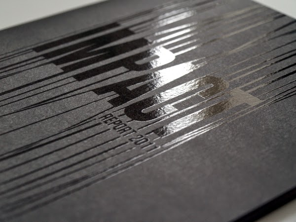
Varnishes can be glossy like the example below:

Or matte:

Lamination
Lamination adds a layer of protective coating, often glossy or matte, to the printed surface while also improving its sturdiness and water resistance. Lamination also has the added benefits of improving the tactile feel of the printed surface, lending it a smooth finish. If a high gloss laminate is applied to the printed surface, photos images appear to have more contrast and have better sharpness, as shown below:

Matte Laminated prints:

Typically, lamination is used if sturdiness is required such as for business cards and soft covered books. It also turns out to be one of the most expensive print finishes.
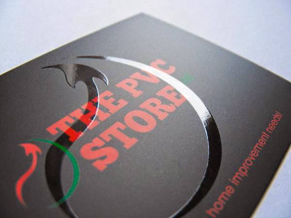
Spot UV Varnish
Spot UV varnishes are paper varnishes applied to the printing surface and is cured or hardened by the UV light during the printing process. This results in a glossy coating on the surface of your print, as shown below:
 UV Varnishes are usually used as a spot application where only specific parts of the page get a UV varnish.


This effectively gives texture and focal interest to different areas of the printing surface while leaving other areas untreated.


 Foil Stamping
Foil stamping is the use of a malleable metallic material applied to the print surface by using heat and pressure. It adds reflective properties to various elements of your design and can serve to add a bit of luxury to your project.

Typically, it is used on text and the logo on the page or when certain elements call for it.


Embossing 
Generally, embossing refers to raising parts of the page for emphasis and texture.


Embossing also adds a tactile dimension to your design. Images and text are literally felt. The print finish adds physical depth to the embossed elements and thus, shadows and highlights are also produced in the design.

Often embossing can be combined with other printing techniques such as foil stamping to enhance the effects of both techniques.


Letterpress
Letterpress printing is one of the oldest printing techniques available. Some printers may call letterpress printing by the term debossing.


A letterpress is used to depress or indent certain portions of the page. It can be seen as the opposite of embossing. Traditionally, the letterpress technique was used only for applying ink on a page as a form of relief printing and usually for text. But it has evolved to also include pressing logos and other design elements directly into the paper substrate.


To summarise everything I have researched on different print finishes I have found it very useful as I wasn't aware of the many different ways to finish a print and the effect they all have. All of the techniques will essentially cost more but will be worth the satisfaction of a well designed piece of art. Its made me realise that the final stages in your design process should not be rushed but to really consider what will be the best format to execute your idea.


Popular Posts

Search This Blog

Blogger news