These are the fully edited photographs taken of the feminist zine myself and Rebecca created. There any many strengths and weaknesses proven throughout the zine but with more time could have been compensated for. The use of imagery and the illustrations help bring energy and character to the zine whilst breaking up the information and bringing more context to the content and keep the audience engaged with the zine.

Breaking up the gender symbols and presenting them throughout the zine in a deconstructed way has added embellishments to the pages whilst also communicating how the constructs can eventually be broken down with honest information and education that will open people minds and understand what is 'normal' and what isn't. 

The front page engages the audience in a form of using the word Feminism and splitting it across two different stocks to combine and make the word but in a deconstructed way. This is to communicate that the issues we face with are nothing but hypothetical, the constructs are in place but the opinions and views are nothing but our own and that with the right information we can broaden out knowledge and be more accepting and challenging to the issues we are faced with. This can also be expanded to possible future zines that challenge issues in society such as racism, sexism, communism, capitalism and educate people further.


From research myself and Rebecca decided on making a modern contemporary feminist zine that will debunk feminism for what it stands for and make sense of the mass confusion of feminism that is currently out there at this point. We felt that the purpose and movement of feminism was being lost with the rise of radical feminists that are using feminism for political purposes and addressing men in a negative and degrading way. When in fact feminism is something that call for equality for all genders, the zine will also focus on the oppression that males have to face and give information on how they can suffer too. 


With the content collected from research and images were collected for the zine I began by sketching out ideas for how the zine would look and what would work best at communicating the information that will be presented on the page. I did not want the pages to be overcrowded with too much information as it would loose interest with the audience, using illustrations and imagery will help break up the information and give more context to the information on the page. 

For the front cover of the zine we wanted to keep it minimal yet relevant to the zine. I had an idea to use different stock and create something that will engage the audience more with the zine itself. This was to use either acetate or tracing paper and use the word 'Femin' and 'Ism' printed on the different papers, both together will create a different affect as the word 'Feminism' is broken up which communicates how these constructs are something that we have created ourselves and that with good information and education we can break up and understand these constructs in a different light. This could also progress the zine as different topics could be used such as racism, sexism, communism, capitalism and other issues that the world is faced with. 


After printing these experiments it proved what were the strengths and weaknesses within the design. I found that the acetate made the zine look too amateur and plain to help communicate what the zine was offering. The tracing paper however, proved a success as it had a softer approach at presenting the title of the zine. I experimented with the different colours as this was also important at communicating the zine. I found that the colours black and blue worked successfully as it was still clear and understandable yet communicated from a more neutral ground. 

Myself and Rebecca decided that the colours blue and red would be relevant to use throughout the zine, we felt that using pink was too generic and wanted to try something different. The blue and red chosen gave more of a neutral ground and represented the use of biro pens that are used by people to write their notes and thoughts, it also communicates that the zine could have potentially been passed through many hands which have each added their own research and thoughts. 


I then collected images from the internet from the first and second waves of feminism. The images selected I felt helped capture the movements in the purest form, it documents what was going on at the time and bringing more context to the information on the page that these things actually happened. The use of the suffragette propaganda I also felt were useful to use in the zine as they also helped communicate how society reacted to the first wave feminism and revealing the attitudes of people who responded to these movements.  

Rebecca helped gather images from the internet of feminism in modern society and how people were responding to the issues we face today.

We then decided that for the images to fit with the theme of the zine they needed a duotone affect to make them appear red and blue. This communicates an element that the images could have been scanned and photocopied bringing together the different ages of feminism in one singular theme. We then decided that to make the zine more engaging and present elements from the riot grrl zines, illustrations and hand rendered type would help bring the pages together and also adding an element of creativity.

These are the different illustrations and type experiments from Rebecca, they communicate the purpose of the zine in a fun an engaging way. The use of illustrations will also help bring the zine to life and make it not appear so flat and boring. Using different and quotes helps tone down the zine to make it less serious and more of an open discussion with various opinions. I then decided to take sentences from the content of the zine and write these sentences to scan into the zine, this will break up the information on the pages of the zine whilst drawing in the reader.


After taking various sentences and writing them out to scan into Photoshop I could then digitally enhance them further to see what would work and what wouldn't. The type I wanted to look hand drawn and as though it could have came from the time the information is about, although many experiments and developments were took in place to ensure that the type was legible and understandable to the audience. Also taking the gender symbols and breaking them down into separate shapes proved useful as they could bring excitement to the page whilst also communicating that the gender constructs are something that have been made for us to conform too and with education we can understand the constructs and be more open minded to those who do not identify with masculinity or femininity. 

We then took turns at creating and designing the layout for the zine. We started with presenting the different waves of feminism at the front of the magazine to educate the audience on the history of the movements. It then goes onto the issues that are faced in todays society with feminism, such as body objectification, the sexualisation of genitals and the generation Z that are battling these issues in their own way. It shows how people are facing these issues in their own form and communicating their voices online to help others relate and understand what is normal and what isn't. We started adding imagery and the illustrations to help break up the information on the pages as we didn't want it too busy and overcrowded as this would confuse the audience. 

Eventually after much development we came to a solution for the layout and information on the pages of the zine. The use of illustrations and imagery throughout helps bring more context to the information presented and give the audience something visually exciting to look at. The type selected for the header as Lulo as we felt this communicated the zine in a contemporary but relevant way, the outlines represent that we must investigate and educate ourselves further in order to understand the issues of the world and how everything that is presented to us may or may not always be the truth. It also reflects that the outline of ourselves does not define us and that individually we have much more to offer underneath physical appearance. The body text selected was Futura Italic, I felt this helped present the information in a clear and legible way whilst fitting with the theme of the zine. The zine is now ready to be test printed and printed digitally, the stock chosen must be flexible but with stability and that could be passed through numerous hands without deteriorating.


These are the final Photoshopped images from the photoshoot. It proved a success as the yellow theme used through connotes a optimistic and fun element which will engage the audience with the brand. Together myself and Alex created the packaging, icons, menus, business cards and logo, these work well as a collective whilst also working separately. 

The icons represent what the cafe has to offer inside in a simple and creative way, they work throughout the brand as shown on the menu and packaging. The logo also supports the brand as the type is clear and legible even from a distance, the layout creates a engaging and unique way for the audience to perceive the brand.

The packaging size has been considered to fit on one hand of the audience, this is to make sure that the consumer can eat the product with the other hand which communicates that the cafe offers food with ease and not something that will take up too much of their time on their day to day lives. The icons have been printed onto tracing paper to bring the packaging together and give something to catch any unnecessary mess from the product.

The menu has been designed in a simple and understandable way, with three different columns of information it presents what the cafe is offering in simple and understandable. The audience will select a bread, select a topping, then select a drink, we wanted the cafe to communicate to the audience that the experience of purchasing any products will be with ease an fuss free. 

Overall the brief has been a success and working with Alex collaboratively has utilised our skills to create something unique and fun. There has been strengths and weaknesses throughout the brief and many issues that we have faced however, we've found solutions to the issues and created something that works and communicates what the cafe has to offer.


These are the final photographs that have been edited in Photoshop. It proved a success as the packaging for each individual product works on its own and together as a theme. This can be extended to further design and products that could possibly be available to the public. The colours are represented well as they do not signify masculine or feminine connotations which was the purpose of the brief, they are available for all genders and skin types. 

The design of the packaging contains elements from the ingredients that are in the products, for the shower gel it mainly contains Quinoa which locks in moisture and is naturally good for all skin types. The shampoo and conditioner contain Coconut and Aloe which again as a collection work as treating and nourishing the hair, the moisturiser contains Calunda which brightens and protects the skin, again a natural ingredient for the skin. Breaking down the elements from these naturally sourced ingredients helped formulate a pattern which communicate what is inside the product in an engaging and fun way. 

The label is clear and legible even at a distance which proves a success as these products will be competing with other cosmetics available in stores and will need to stand out. Overall I feel the brand has been a success and after receiving feedback from both males and females it they have said they would purchase the products if they were available and do not look as though they are masculine or feminine. 


To decide a name for my gender neutral brand I firstly decided to investigate into what it means to be gender fluid. Non-binary, gender expansive and agender all represent a person who does not identify as male or female, this is an interesting way to communicate my brand however I feel as though using those words would put too much of a label on gender fluidity and address the audience with something they may already have pre conceptions about. 

I found that in some cultures such as the Native Americans, have accepted four genders and describe it as 'two spirit'. The four genders are feminine man masculine man, feminine female and masculine female, this would be a useful name to refer to for the brand name however, again its creating more constructs for people to identify with therefore loosing the purpose of the brand; creating something for both males, females and people who don't identify as those genders. 


After deciding on the name Hen for my brand I took to my notepad and experimented with different visuals. I wanted to keep the type neutral but strong enough to stand out from the shelf. It could not contain brackets from a serif font as this would signify a feminine aspect, the same would apply to a bold san serif type that would communicate a more masculine element. I tried experimenting with the different letters themselves to reflect the breaking down of the constructs and creating something fresh and new. 


The name I decided on is 'Hen' 


Hen

Ideas:

The first idea I have is to create a brand that uses organic ingredients that are non harmful to the skin. From research gathered it was clear that there is a wide selection of plants that can benefit the skin and hair in some form, almost like its the earth's own pharmacy. This initiated the idea to communicate that gender is another form of earth's nature and that we should accept what is offered to us and work together to create something better.

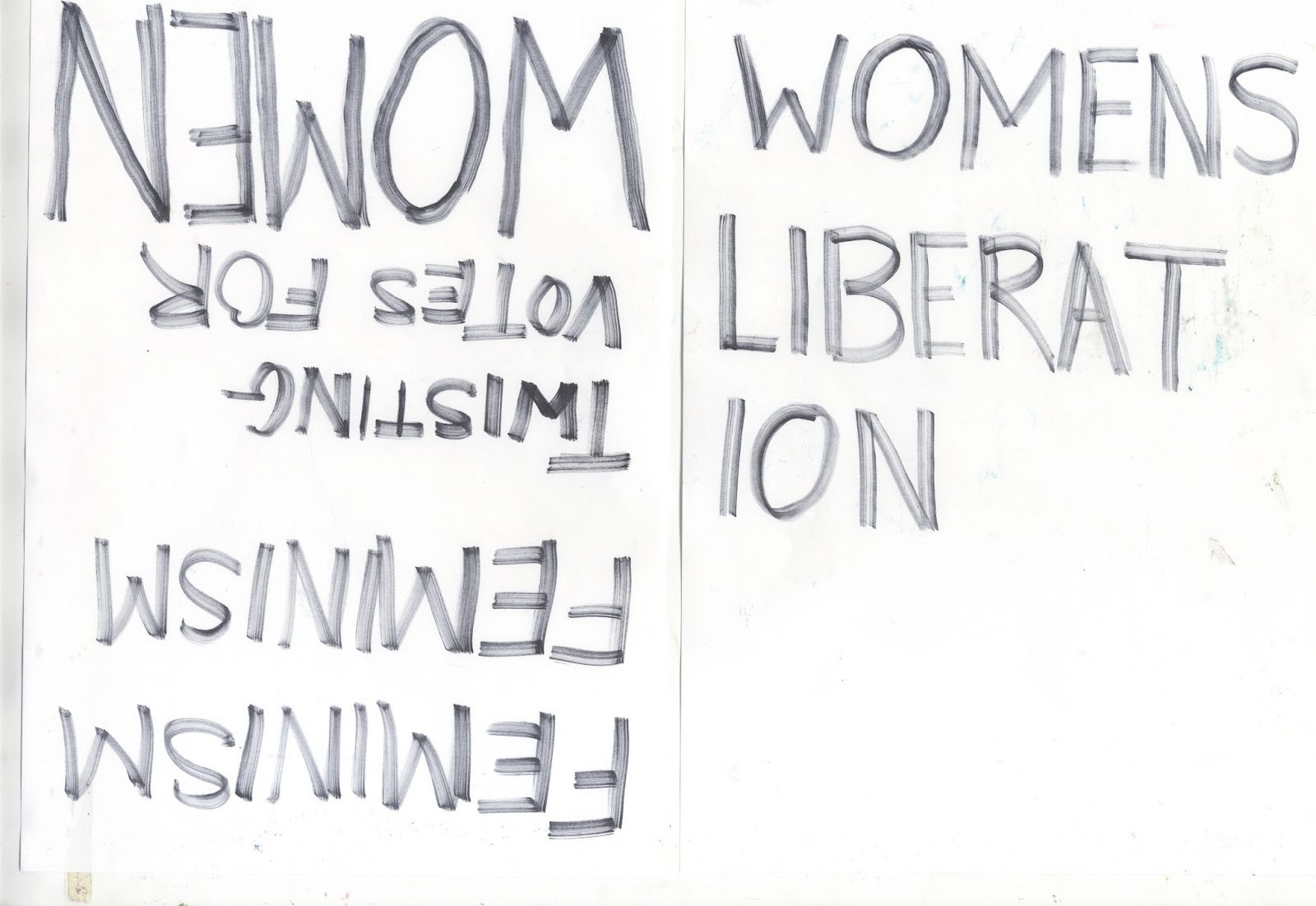
The second idea I have is to create something more contemporary and clean to communicate from a neutral platform. Different colours would be used to communicate gender fluidity and how the product is available for everyone. The colours will be excitable enough without fading into a shop shelf yet hold a sense of quality and trust within the brand.

The third idea I have is something that requires a lot more time however, I would like to create called 'me' and use that initiative to build a brand that could satisfy any audience no matter what hair or skin type. It would be organic and non harmful to animals and address the audience on a more personal level. 


Picking the first idea I began by deciding the packaging, I wanted rectangle boxes that would fit the different products inside, this was keep a consistent theme throughout and be none suggestive to a particular gender. It would also take up less storage if the boxes were more rectangular and straight. It was at this point that I started to sketch different layouts for the front of the packaging to see what would work and what wouldn't. 

Dimensions for boxes

Shower gel - 18 x 7 x 7 cm
Shampoo - 15 x 6 x 6 cm 
Conditioner - 15 x 6 x 6 cm
Moisturiser - 10 x 4 x 4 cm


Ordering some empty containers off amazon will also help bring the brand to life as it will show the audience how the products look themselves and not just the boxes. 


After deciding on the size of the boxes I continued experimenting with different labels to see what would be best at communicating my idea. It consists of three different labels that could be used, firstly it could be a standard stick on label that covers a small part of the front (see red rectangle), another idea was to use a thicker wrap around label that would be pull off to open the product (see green rectangle) this would be useful however for the audience it could be unnecessary and none beneficial to them. Finally the third layout I sketched was to let the background dominate most of the front cover with the logo and information situated at the bottom of the packaging, this is to let the product represent itself without the logo being the first thing the audience sees.

Experimenting with type helped develop a logo which I felt covered a more neutral ground and did not signify masculine or feminine connotations. I tried two fonts, the first being Swedish Sans and the second is Sophia Pro. Both san serif fonts communicate a more neutral level and are none suggestive towards a particular gender. After much experimentation and development I found that keeping the font with a horizontal baseline and spaced kerning held the purpose of the brand without being too overdone and loosing its legibility. 

From research, I've taken swatches from each picture to formulate a palette that communicates a more neutral element without being suggestive towards a particular gender.

Once the swatches were selected I then separated the colours into two categories, masculine and feminine. As my research informed me the colours associated with feminine were mostly soft pastels and bright colours, whereas the colours associated with masculinity were harsher darker colours. 

As in my previous project I had struggle to choose a colour theme for my packaging and ended up deciding on colours that did not communicate gender fluidity or worked as a theme. This time I have came to the solution to combine both sets of colours that are most associated with femininity and masculinity. This will create a new theme of colours which will take away those pre conceptions of colours that are associated with gender. 

I decided that I wanted to use a type of pattern on the packaging that communicated the ingredients in a new way. As I am creating something that does not conform to the gender constructs the pattern can be scattered and abstract but keeping elements from the ingredients themselves as not to look like random shapes. 


Finding images on the internet of the ingredients helped get and idea of the different shapes involved in the pattern.

Roughly tracing around the ingredients helped create different shapes that alone would not communicate anything but together as a theme help the audience understand what it is. The colours chosen were a mixture of masculine darks and feminine brights, this was to create a contrasting theme that at first may not look appealing but to go as a theme works well. I applied this same technique to the experiments below until I was happy with the outcome. 


Keeping the theme consistent was a challenge with these patterns. As each plant and ingredient was so different from one and another it was hard to keep the legibility of the illustration to stop it looking like a random shape. The colours selected I used the Scandinavian inspired palette which helped bring a more neutral platform to the designs without being suggestive towards a particular gender. Adding the shapes to different layers also brought depth and detail to the patterns and make them appear less flat.  


Once complete I added the patterns to the packaging nets to see if they would work as a theme and did not look too overcrowded. After much trial and error it was beneficial to let the patterns have more space to breath and make them look less cluttered. Although, when the packaging would be made it would reduce the business as the pattern would be working across multiple sides. 

Referring to my previous sketches I mocked up the labels on the front of the packaging to bring the idea to life and see if it worked. Trying multiple layouts helped get an idea of what worked and what didn't, I found that the fourth layout on each set was inconsistent and the weakest out of the attempts, it appears to have too much white space and does not make the product stand out. The other attempts on the layout were much more successful and I felt helped communicate the product in an understandable yet engaging way. 


The next step is to print out some mock ups and see if the packaging and front labels work. 


Printing out mock ups of the front label helped get a better understanding of what was the strongest and weakest layout. The first three proved the strongest as the fourth layout looked squashed and illegible for the audience. The print out also showed the colours that were used in the designs which I am pleased with, they are bright but not overpowering and worked well as a theme throughout the different products. 


I decided that the two strongest layouts were the wrap around label and the other standard front stick on label. After printing the mock up nets out I could then build the packaging to see if it worked and decide which label was the strongest. After much debate and feedback it was decided that the wrap around label was the strongest as it separated the busy background from the information presented on the front. It also left enough room for the information to be clear and legible as not to confuse the audience on what the products are offering. 


With previous development it was then decided to print the packaging digitally. The stock chosen for the nets was a 120 gsm matte paper which I felt would enhance the colours of the pattern design without being too distracting. A glossy or satin finish would make the packaging look cheap and reflect too much light for the design.

For the labels I went with a thinner 90 gsm stock to give the labels flexibility when wrapped around the packaging and also make it easier for the audience to remove if they choose so. Again this was printed on matte stock which helped bring the packaging together as it did not distract the eye from the designed background either.

After making up the packaging I then wanted to professionally photoshoot the products to make them look more real and as if they were available to the public. This proved a success as the design worked as a theme but also separately if needed, I also tried the labels onto bottles to bring the designs to life and give the audience more of an idea of what the product looks like. The main issue I had was making the packaging, as I was short on time some mistakes were made when building the packaging which is shown in some images. However, these are not the final images as they will need to be developed further in Photoshop therefore I can fix some mistakes. 


Popular Posts

Search This Blog

Blogger news