Experiments and Developing Ideas

This is experimenting with an idea and to see if it works. I used the outline of the British flag because I think its an important element to feature in my design as it gives the sense of being patriotic and proud of your country. I chose a serif type as I thought it would be most appropriate as it brings that traditional element to the design.

I then added a bevel and emboss on the design as it gave more of a texture the actual coin would have if it were embossed. I chose Times New Roman as the main type, scaled it larger and positioned it into the center of the coin which I thought looked most successful.

Part of the mandatory requirements for the design was to have the 'One Pound' somewhere on the coin. As my design was minimal and had a lot of structure I struggled a little to find a position and size that would be appropriate. As the coin itself is no larger than a one pound coin I needed to make sure that I didn't scale down the type too much otherwise it would not be legible.

This is another layout I went for the one pound part. This however I do not think is as successful as it looks too cluttered, plus because the one pound is not intact that big I fear that it will not be legible if it were to be embossed.

I then tried to position the one pound around the outside of the silver part which I think looked a lot better. Its clearly legible and I think suits the design of the pound coin. It leaves enough room for the main focus in the center.
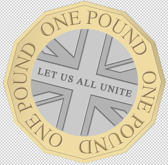
I added a bevel and emboss to the type which enabled me to get a better look at how the coin would look like if it were embossed in real life. I then shaded in parts of the coin where I thought could be different depths of emboss to take away the flat looking design.


