Leeds Print Festival
The brief that was given asked us to use GFSmith stock and create a design that would use any and as many traditional print methods as we may choose. This left room for a lot of creative freedom, I decided that I wanted to try hand rendered type to represent a chosen song, as the type itself, the colour and sizing can communicate a song effectively I thought this would be a perfect opportunity to experiment and see what outcomes I could make. I began firstly by looking at existing typographic posters that have used lyrics to communicate various songs.


Above are a few typographic posters selected from the internet. There was not much choice when it came to researching typographic posters that have used lyrics to communicate a song therefore this left room for opportunity on what I could create myself. The posters vary with the size and style of the type, I do not think they have been pushed enough creatively to communicate the songs at their best ability. The size, layout and colour of the type does communicate the songs to an extent however I find that the hierarchy is sometimes lost within the layout which miscommunicates what the poster was intended to do in the first place. The more hand-drawn poster works effectively as it gives the lyrics more character as though they have just been spoken however, the use of multiple type on the page makes the poster loose its effectiveness as its hard to read at some points.
I decided from this point that the song and artist I was going to create a typographic design from was The Cribs - Be Safe. The melodramatic sound alongside the America narrative throughout gives mixed messages at to what the song actually means leaving room for the audience to interpret it as they please.
The narrative of the song basically explains that no matter what you wear, who you hang around with, what petty concerns or issues you may have, does not matter as eventually we all have the same fate: death. Although the song's chorus sings "I know a place we can go where you'll fall in love so hard that you wish you were dead" giving the song a kind of optimism that love will override everything therefore we should focus on love instead of the petty concerns.

I began by drawing out the chorus over and over with the same pen to see what I could experiment with. I wanted the lyrics to have more of a narrative and appear less static therefore the hand-drawn type would communicate this effectively. As the song is quite morbid I tried to reflect this using the type as though someone had wrote it down in anger or frustration.


After scanning in the type I could then develop how the type would appear. I tried to keep it with some kind of narrative whilst making sure that the type was still legible. At first it was difficult to fit the type on one page as the dimension for the stock was 23cm x 23cm, however after much trial and error I came to a solution which presented the type with more of a hierarchy which helped the legibility and flow of the type.


The print process I decided to go for was screen printing and foiling. I firstly tried a print using just black ink, this was a success however, I found that it did not communicate the song effectively nor created a more positive atmosphere which is what I intended. The stock I was getting was Pristine White by GFSmith, therefore I thought a bronze or gold foiling would be beneficial as it would create the opposite effect to the meaning of the song and the hand-drawn type itself. My concern was if the foiling could pick up the details on the hand rendered type as the type was drawn with a rough pen however, this proved a success.
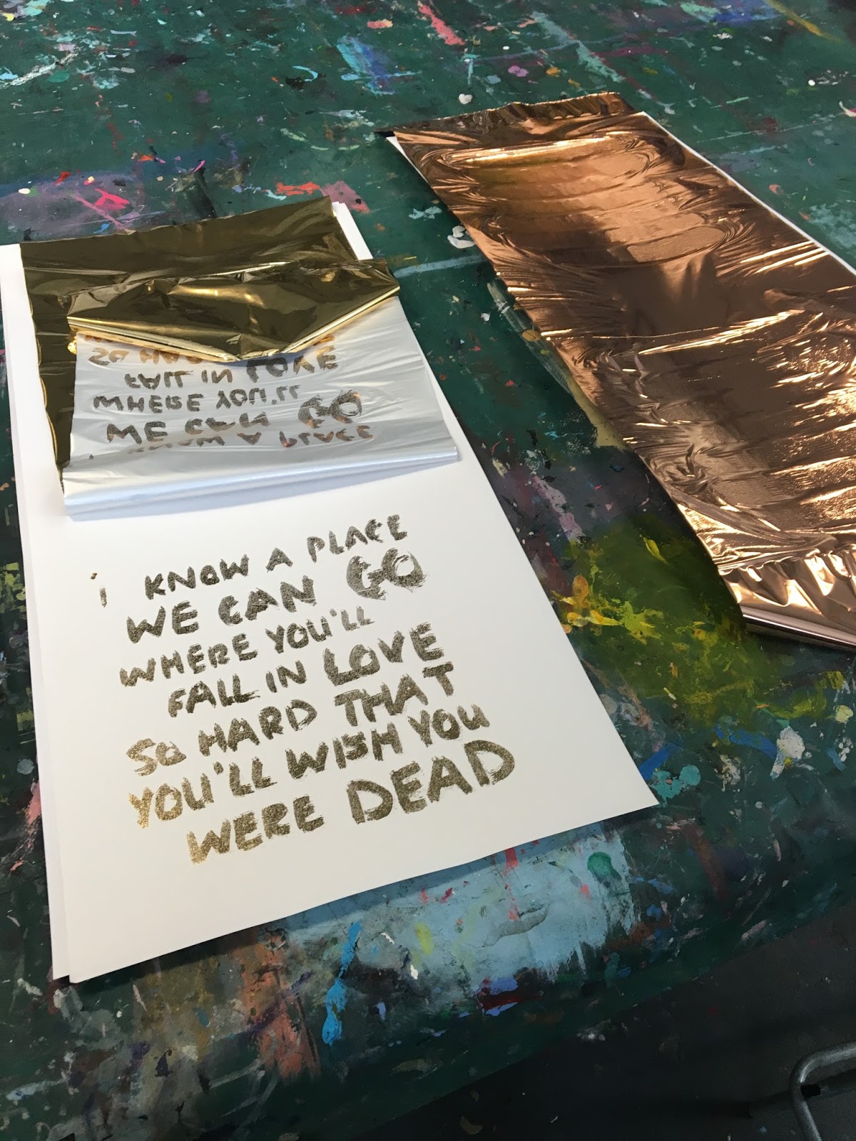

The outcome proved a success. I opted for the gold foiling over the bronze as I felt it gave a brighter optimistic element to the design. The foiling worked effectively against the pristine white stock, it communicates a more positive aspect to the lyrics which are morbid at best. The hand rendered type reflects the meaning of the song, giving it character and a sense of frustration and anger, the foiling brings it to life creating the opposite affect to what the type had created.


