From research myself and Rebecca decided on making a modern contemporary feminist zine that will debunk feminism for what it stands for and make sense of the mass confusion of feminism that is currently out there at this point. We felt that the purpose and movement of feminism was being lost with the rise of radical feminists that are using feminism for political purposes and addressing men in a negative and degrading way. When in fact feminism is something that call for equality for all genders, the zine will also focus on the oppression that males have to face and give information on how they can suffer too.


With the content collected from research and images were collected for the zine I began by sketching out ideas for how the zine would look and what would work best at communicating the information that will be presented on the page. I did not want the pages to be overcrowded with too much information as it would loose interest with the audience, using illustrations and imagery will help break up the information and give more context to the information on the page.
For the front cover of the zine we wanted to keep it minimal yet relevant to the zine. I had an idea to use different stock and create something that will engage the audience more with the zine itself. This was to use either acetate or tracing paper and use the word 'Femin' and 'Ism' printed on the different papers, both together will create a different affect as the word 'Feminism' is broken up which communicates how these constructs are something that we have created ourselves and that with good information and education we can break up and understand these constructs in a different light. This could also progress the zine as different topics could be used such as racism, sexism, communism, capitalism and other issues that the world is faced with.


After printing these experiments it proved what were the strengths and weaknesses within the design. I found that the acetate made the zine look too amateur and plain to help communicate what the zine was offering. The tracing paper however, proved a success as it had a softer approach at presenting the title of the zine. I experimented with the different colours as this was also important at communicating the zine. I found that the colours black and blue worked successfully as it was still clear and understandable yet communicated from a more neutral ground.
Myself and Rebecca decided that the colours blue and red would be relevant to use throughout the zine, we felt that using pink was too generic and wanted to try something different. The blue and red chosen gave more of a neutral ground and represented the use of biro pens that are used by people to write their notes and thoughts, it also communicates that the zine could have potentially been passed through many hands which have each added their own research and thoughts.

I then collected images from the internet from the first and second waves of feminism. The images selected I felt helped capture the movements in the purest form, it documents what was going on at the time and bringing more context to the information on the page that these things actually happened. The use of the suffragette propaganda I also felt were useful to use in the zine as they also helped communicate how society reacted to the first wave feminism and revealing the attitudes of people who responded to these movements.


We then decided that for the images to fit with the theme of the zine they needed a duotone affect to make them appear red and blue. This communicates an element that the images could have been scanned and photocopied bringing together the different ages of feminism in one singular theme. We then decided that to make the zine more engaging and present elements from the riot grrl zines, illustrations and hand rendered type would help bring the pages together and also adding an element of creativity.

These are the different illustrations and type experiments from Rebecca, they communicate the purpose of the zine in a fun an engaging way. The use of illustrations will also help bring the zine to life and make it not appear so flat and boring. Using different and quotes helps tone down the zine to make it less serious and more of an open discussion with various opinions. I then decided to take sentences from the content of the zine and write these sentences to scan into the zine, this will break up the information on the pages of the zine whilst drawing in the reader.


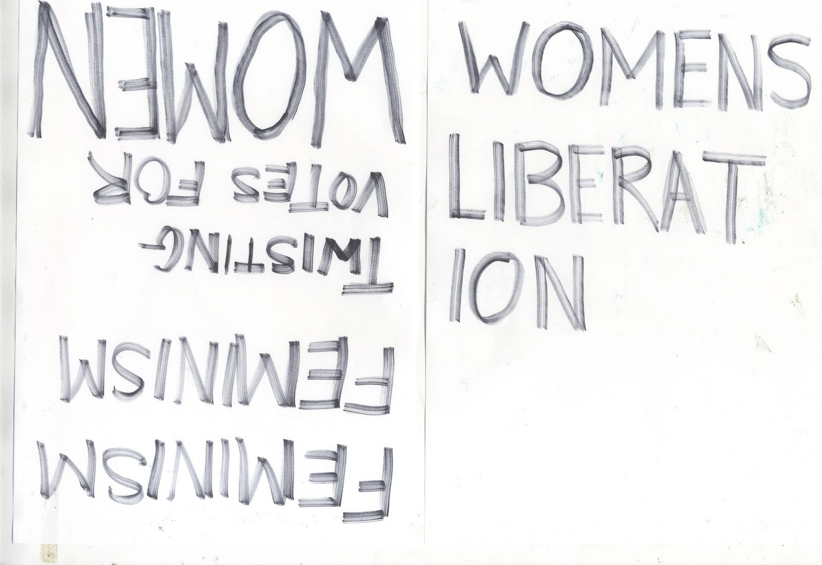


After taking various sentences and writing them out to scan into Photoshop I could then digitally enhance them further to see what would work and what wouldn't. The type I wanted to look hand drawn and as though it could have came from the time the information is about, although many experiments and developments were took in place to ensure that the type was legible and understandable to the audience. Also taking the gender symbols and breaking them down into separate shapes proved useful as they could bring excitement to the page whilst also communicating that the gender constructs are something that have been made for us to conform too and with education we can understand the constructs and be more open minded to those who do not identify with masculinity or femininity.

We then took turns at creating and designing the layout for the zine. We started with presenting the different waves of feminism at the front of the magazine to educate the audience on the history of the movements. It then goes onto the issues that are faced in todays society with feminism, such as body objectification, the sexualisation of genitals and the generation Z that are battling these issues in their own way. It shows how people are facing these issues in their own form and communicating their voices online to help others relate and understand what is normal and what isn't. We started adding imagery and the illustrations to help break up the information on the pages as we didn't want it too busy and overcrowded as this would confuse the audience.


