

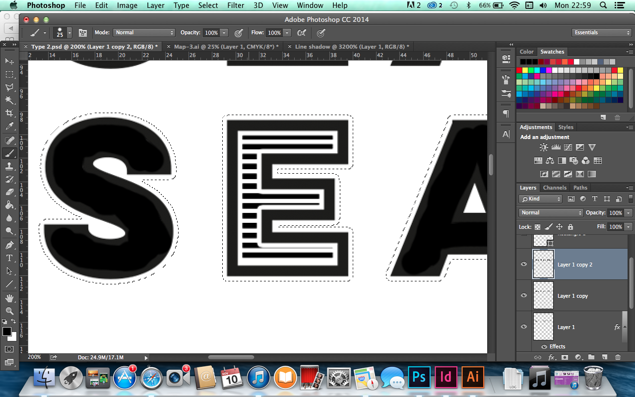
For the type for my website I decided I wanted to go for a striped look as thats what seasides used to feature back at the peak of seaside tourism. Pastel and stripes were recognisable at a seaside so I thought to do type that is similar would be appropriate whilst also looking nice. I chose a chunky san serif type that is not too in your face but you can imagine it being at the fish shop on the sea front. I drew lines and masked them over the top of the type where I then had to use to eraser to get rid of unwanted bits.


Playing around with different effects on the type helped me get exactly what I wanted, I played around with the lines and drop shadow on the type.


