Alphabet Soup
For this brief I was given a random word and typeface. I had to combine the definition of Anatomy word with the typeface communicating visually what exactly it is. The group task was to view the typeface and the word Anatomy and write down the first word that comes to mind which is what the arrows show.
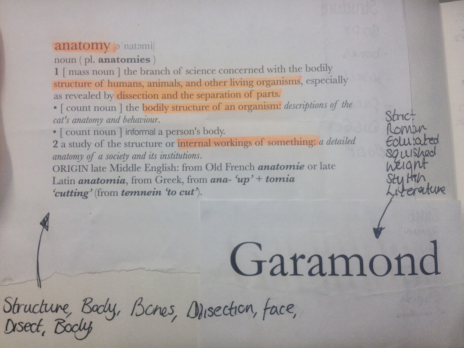
I then drew a mind map quickly brainstorming the definition of Anatomy and what it stood for. This gave me a wide range of possible things I could further research and potentially portray through the typeface Garamond.

I then began research on my typeface Garamond, starting with its history. I found a book called 'A Visual History of Typefaces and Graphic Styles' which had some informative facts on who created it and when it was created. Claude Garamond created the typeface back in the early 1500's, he was also the first independent type designer and punch cutter. The typeface reduced the Gothic type influence around europe at the type as his roman fonts were extremely popular with their refined letter spacing and harmony between capitals and lowercase letters.
These are two examples of the typeface below, the first showing it in practical use and the second an example of glyphs and it in italic.


Both of these images are more research into Claude Garamond and the typeface itself. I found examples of how the typeface is used in present day posters which worked successfully, with its traditional elements I think it would work best for romantic or historic films at it would visually suit the genre.
In the studio workshop we were put into groups and given a task to manipulate and change a letterform from a serif to a san serif and vice versa. This was helpful and informative on understanding the difference between both letterforms.


These two images below are mock ups and attempts at changing the letterforms. Each person had a turn at trying a different way of manipulating the letterform, then we chose which one was the most successful and worked best. The A I thought was a lot harder with the curved bowls and the tail to remove whilst the R had more structure.


During the workshop we were also taught the terminology of type. Given examples also helped learned the different elements to parts of a letterform.

These images represent more research into the word Anatomy and the typeface Garamond. I began to learn the different systems in the human body that work together to function it. I mainly wanted to focus on the Skeletal, Nervous, Digestive and Muscular systems because I thought they would be more successful at visually representing of the definition of Anatomy.


