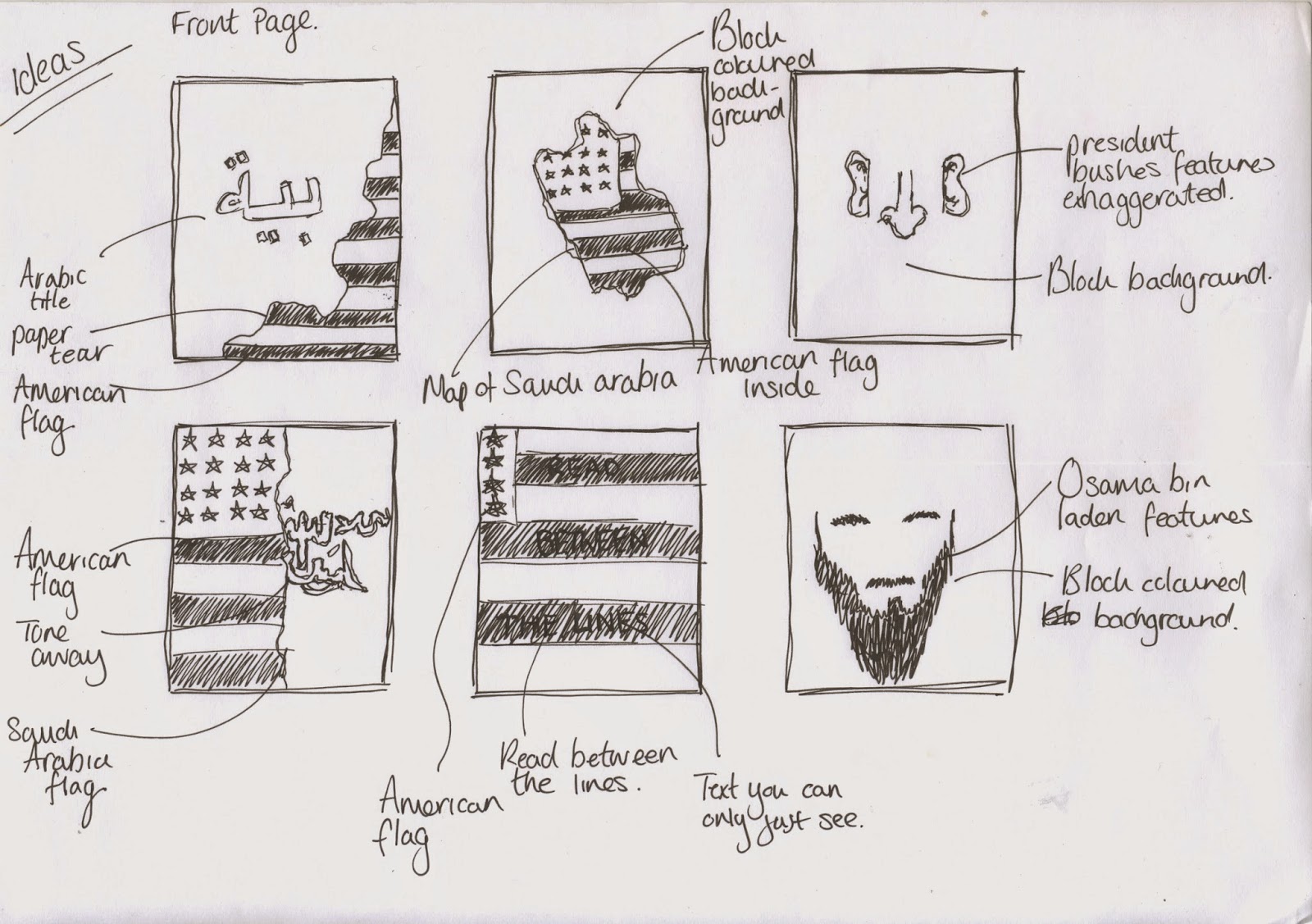
Here are some quick first ideas I sketched out to get an idea of how I want my cover to look. I want to incorporate america's and saudi arabia's social and political identities that will be easily recognisable to the audience. I tried out a mixture of using the american and saudi arabia's flag's which would have some form of tear revealing the other flag, this will represent the mistrust and dishonesty western society has broadcasted to its nation and show that there is other truth behind what we are told.
I've started out with a 32 page publication. The size i'm still yet to decide as it will have imagery and lots of body text therefore I think something as large as A4 or A5 would be suitable, this would leave room for the information to be spread out and not overcrowd the layout. As this is a heavy information based publication I think it would benefit the audience as it will be not too overwhelming.


